Understanding Our Glazes (Beyond Photos)
Every glaze in our current collection has surface qualities that standard product photography can't fully convey.
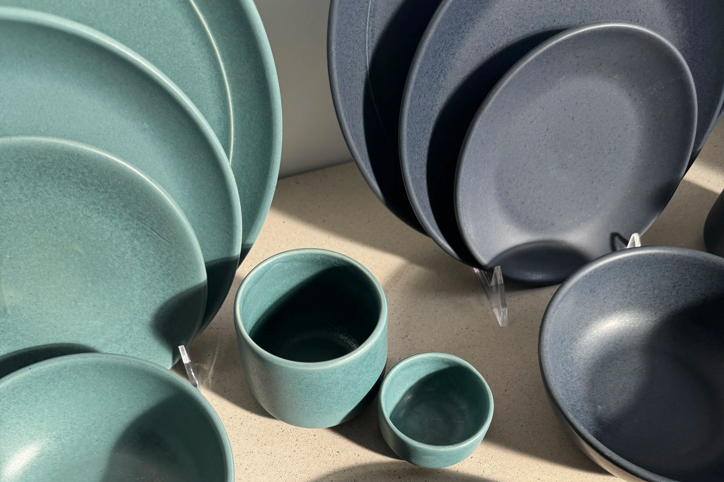
It's something we hear consistently from people who visit our East Providence studio. They pick up a plate, turn it in the light, and say something like — oh, I didn't realize how beautiful they are up close. The texture. The depth. The way the color shifts slightly depending on the angle.
Product photography does what it's designed to do: it shows you accurate color and clear form. But there are qualities of handmade ceramics — surface texture, how a glaze catches light, the way depth reveals itself at different angles — that static images simply can't capture, no matter how skilled the photographer.
This post is our attempt to show you what we see up close every day in the studio.
What You're Missing in a Product Photo
Professional product photography prioritizes accuracy and consistency. Clean light, neutral background, true color reproduction. It's effective at what it does — but by nature, it flattens three-dimensional surfaces into two dimensions.
What a standard product shot can't show:
Texture. Our glazes aren't smooth in the way mass-produced ceramics are smooth. There's a fine mineral quality to the surface — a slight variation that you can see and feel. It comes from the raw materials we use and the way they behave in the kiln. You can see it at close range. You can feel it with your fingertips. It almost never shows up in a product photo.
Depth. Several of our glazes have what ceramicists call a "breaking" quality — the color shifts where the glaze pools in recesses versus where it thins at edges and rims. In Rosewood, that means a thin copper line at the detail line of our Dinner Plate where the brown thins out. In Verdigris, it means the color deepens in the center and lightens toward the edge. In Nightfall, the dappled gloss speckle sits over a satin base in a way that changes completely depending on your light source. None of this truly reads in a flat photo.
Movement. Glaze forms a glass-like surface that responds to light dynamically — differently at every angle. This is why seeing our pieces in person always beats photography. A still image captures one moment of one angle under one light source. It's a significant limitation when the thing you're selling is defined by how it interacts with light.
Touch. The surface of our glazes has a quality that people notice immediately when they pick up a piece — a soft, almost buttery feel that's completely unlike the slick smoothness of mass-produced ceramics. It comes from the same fine mineral texture that creates the visual depth. People often run their fingers across the surface unconsciously, or turn a plate over to feel the glaze on the back. It's soothing in a way that's hard to describe until you experience it. One customer called it "tactile luxury." Product photos can't convey this at all.
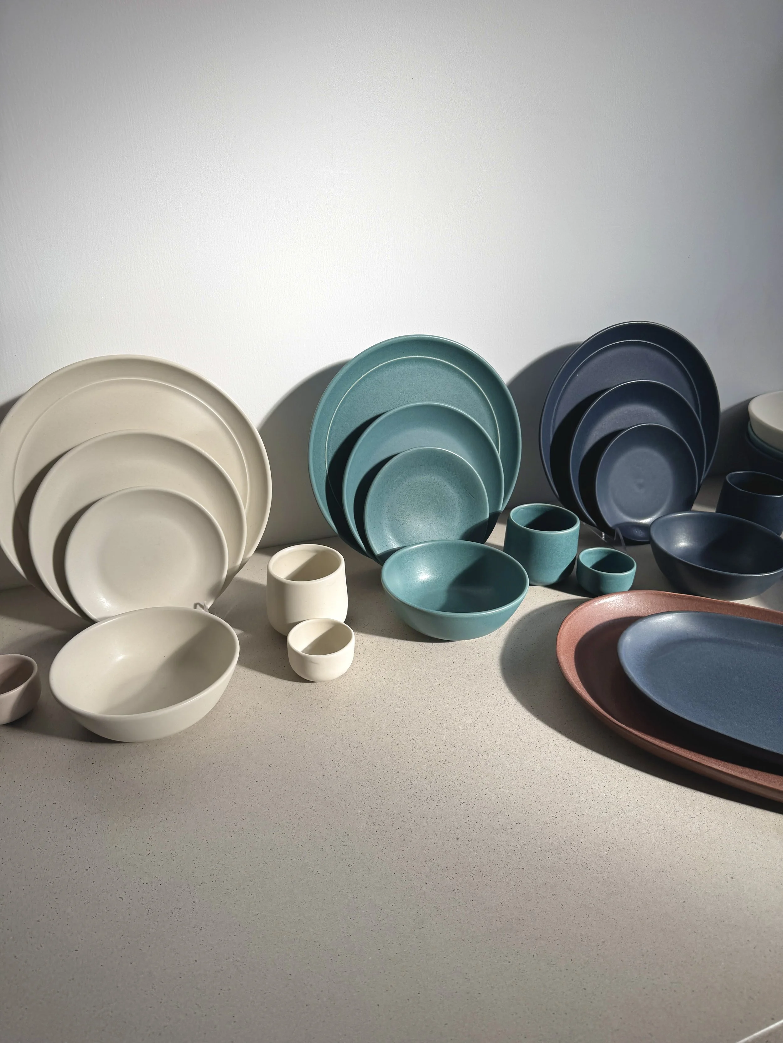
A Closer Look at Each Glaze
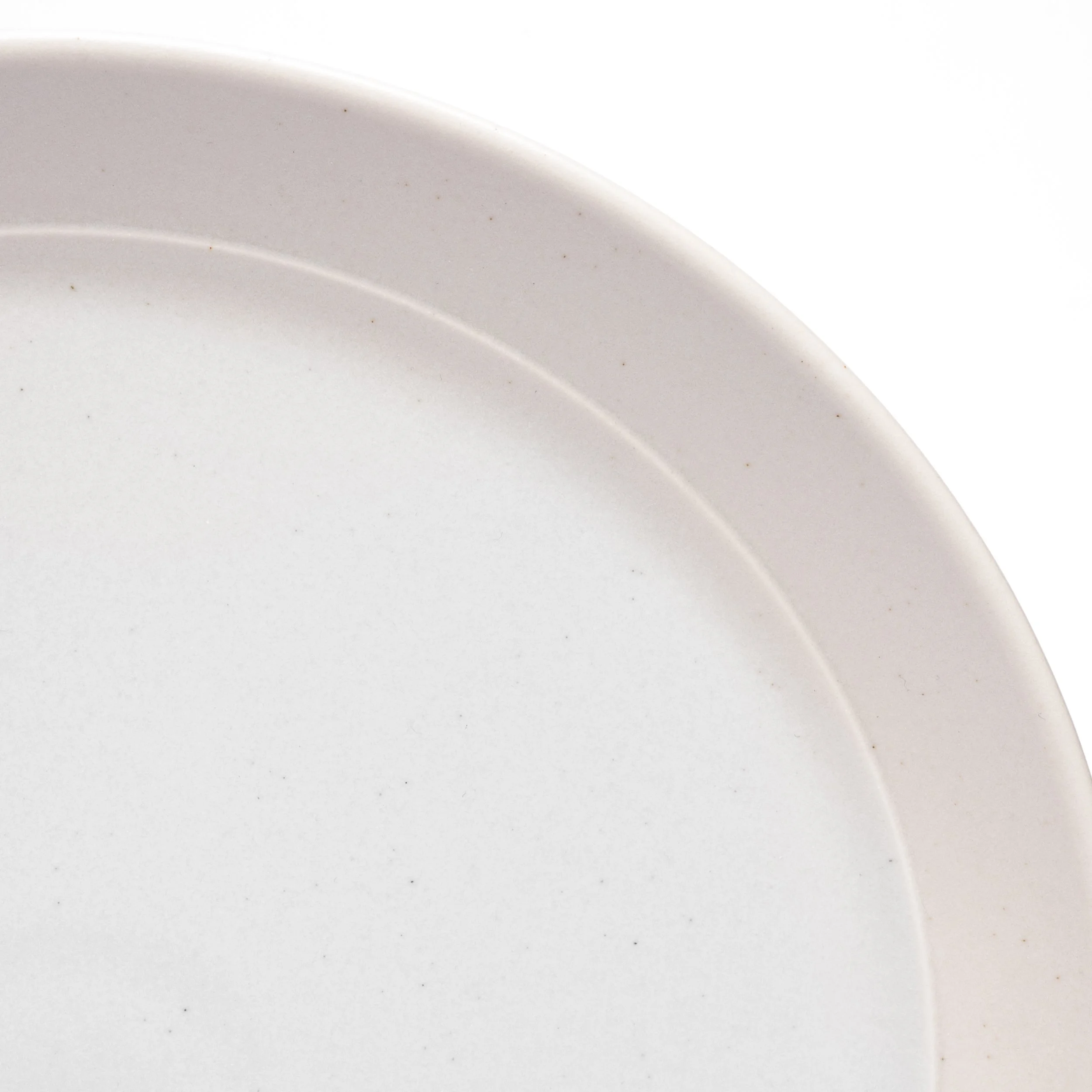
Rosewood
Warm cocoa brown with red undertones and a textured soft satin matte finish.
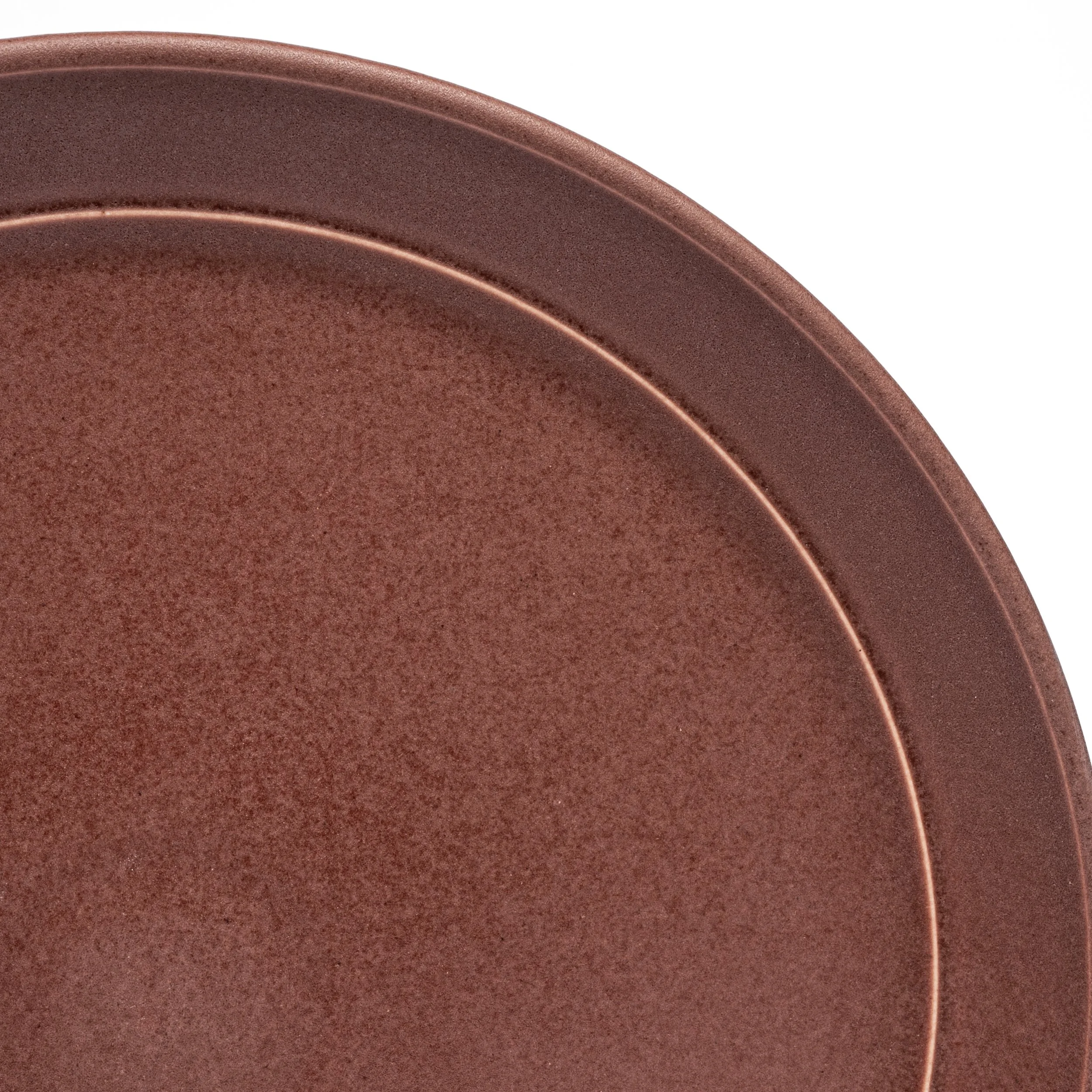
Up close, Rosewood has a fine mineral scatter across its surface — tiny variations in the brown that give it a depth that reads as almost velvety in low light and warmly luminous in natural light. The defining detail is the dinner plate detail line: where the glaze thins at the raised edge, it breaks to a thin copper-rose line that runs the circumference of every piece. It's a detail that disappears in standard product shots and is immediately noticeable in person. Warm, grounded, works with both natural wood tones and richer, more saturated interiors.
Canyon
Warm terracotta with soft umber speckle and a satin matte finish.
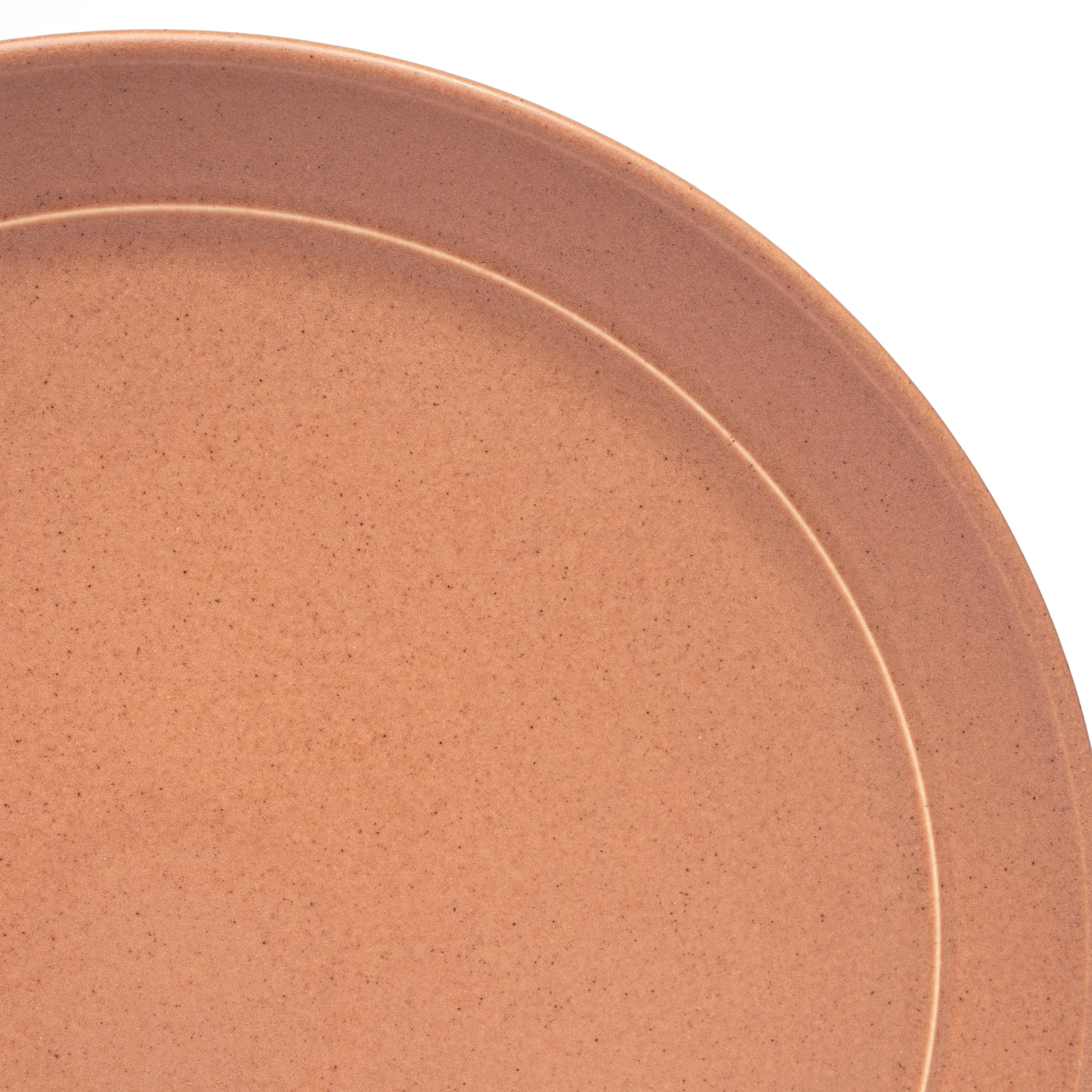
Canyon's surface has a fine speckled quality — small sandy flecks of deeper umber distributed across a warm terracotta base. The semi-matte finish means it absorbs light rather than reflecting it, giving it a soft, tactile quality. In natural light it looks almost earthy; under warmer artificial light it picks up more of the red. Of our warm glazes, Canyon has the most visual movement at close range — the speckle pattern is different on every piece, which is one of the things that makes a mixed table of Canyon pieces feel alive rather than repetitive.
Dove
Soft warm grey with hints of lavender and a satin matte finish.
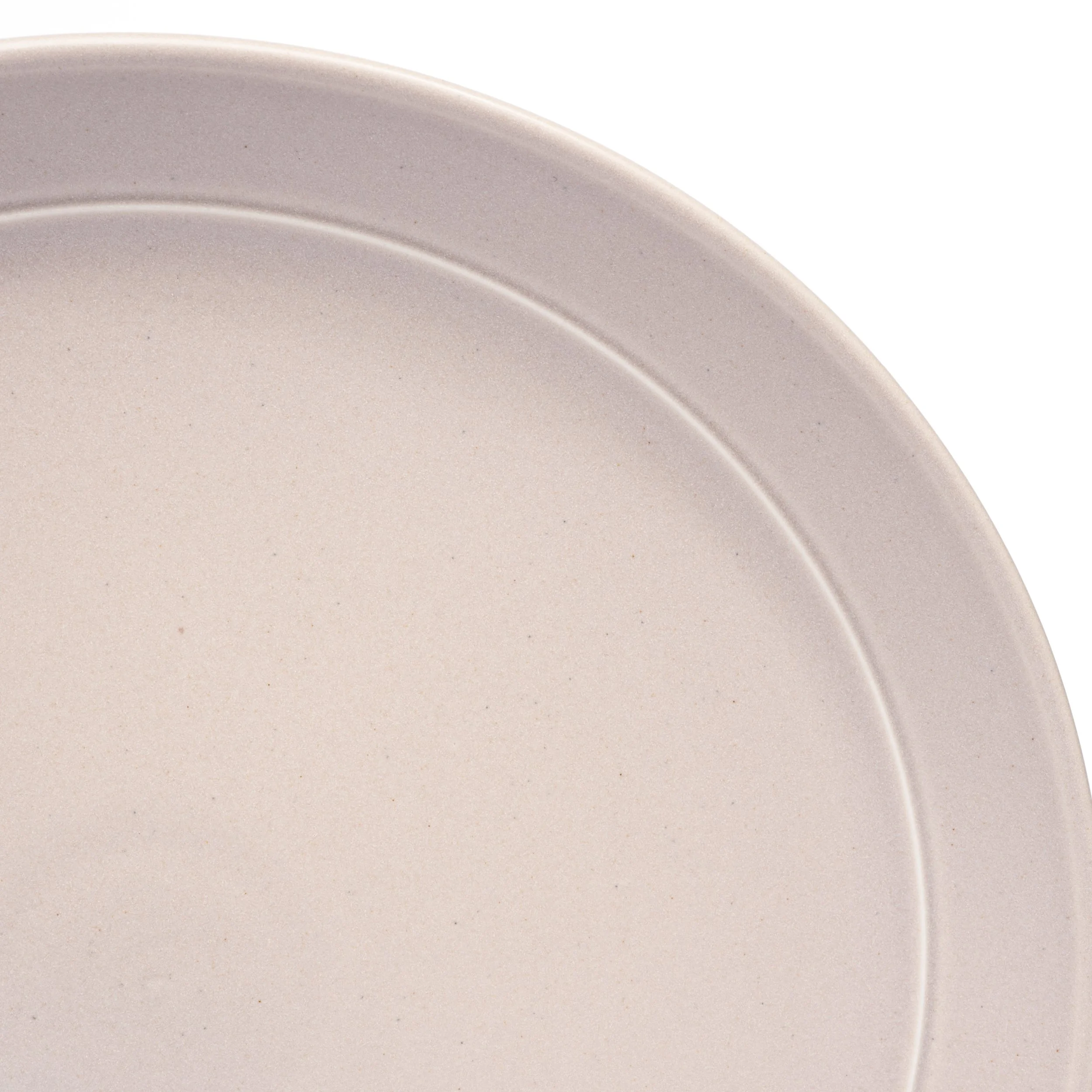
Dove is our most understated glaze up close, which is exactly what makes it useful. The satin matte finish is softly texturered, and the warmth in the grey — the pale lavender undertone — is subtle enough that it reads as neutral in most light but adds something you can't quite name to a table. It's the glaze that works with everything: warm glazes, cool glazes, natural linens, bold textiles. At close range you start to notice that it isn't quite grey and isn't quite beige — it's something in between that shifts with the light.
Moonlight
Simple, sophisticated off-white with a satin matte finish.
Moonlight is the clearest example of how finish changes everything. As an off-white, it could be flat and plain. The satin matte finish gives it a softness that a glossy white never has — it absorbs light gently rather than bouncing it back. Up close the surface has a slight warmth that distinguishes it from clinical white. It's the glaze that disappears into a table setting in the best possible way — present without competing, letting food and other pieces take the foreground.
Verdigris
Greenish copper blue with a dappled gloss patina texture.
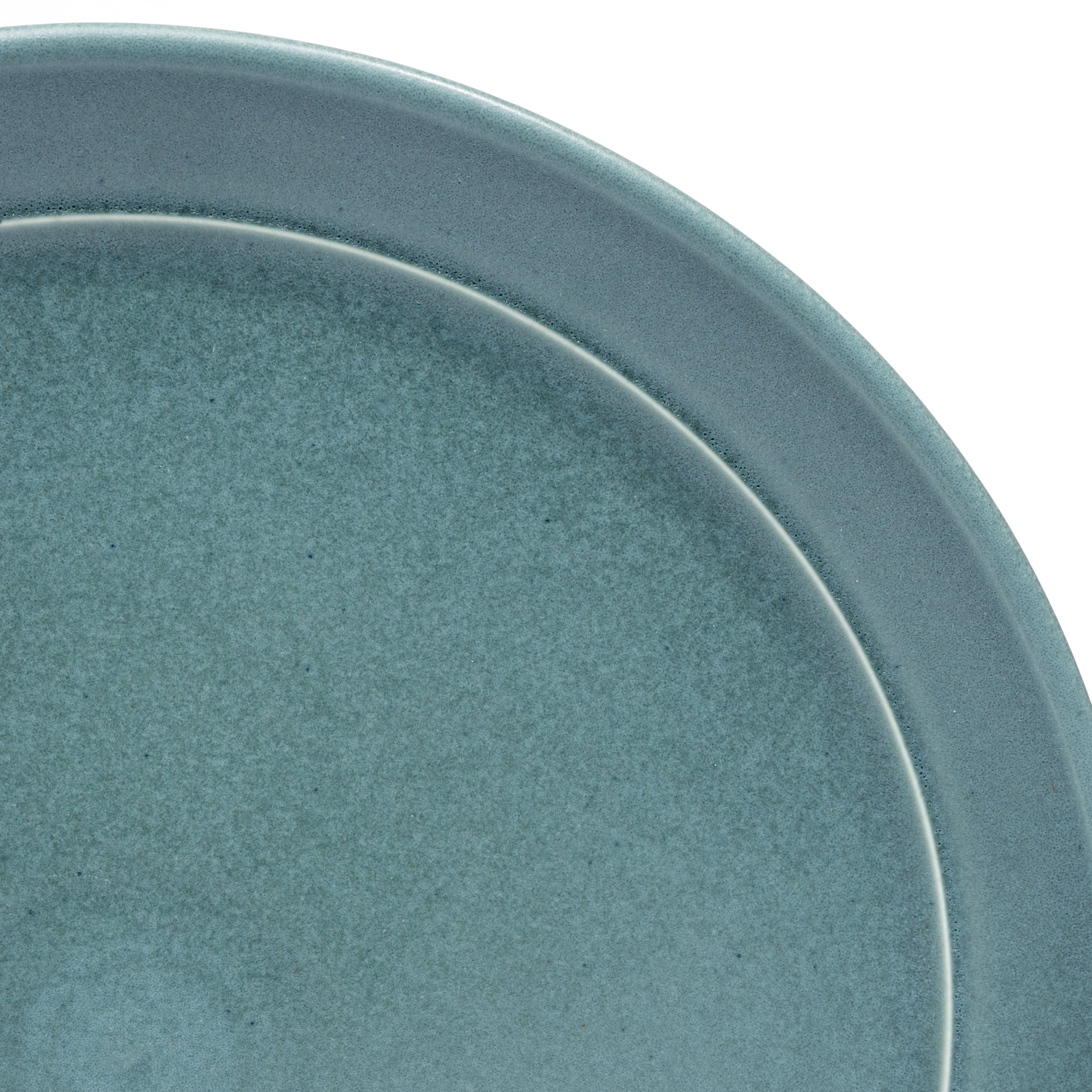
Verdigris is our most complex glaze to photograph and our most visually interesting at close range. The dappled gloss texture means the surface isn't uniform — pools of deeper blue-green sit alongside lighter areas in a pattern that looks almost like natural patina on aged copper or stone. The color itself shifts significantly with light: in daylight it reads as a clear blue-green; in warmer artificial light it pulls more toward teal. At close range the texture has an almost geological quality. This is a glaze where the macro photography does more work than any other — standard product shots show you a color; the close-up shows you a surface.
Nightfall
Rich navy blue with dappled gloss speckle over satin base finish.

Nightfall is the most dramatic of our glazes and the one that surprises people most in person. The base is a deep, rich navy — dark enough to be nearly black in low light, distinctly blue in natural light. Over that base sits a dappled gloss speckle: small areas of higher gloss that catch light differently from the surrounding satin surface. The effect is subtle at a distance and striking up close — like a night sky, which is where the name comes from. On a table it adds depth and contrast without overwhelming. Up close it's one of the most technically interesting surfaces in our collection.
See Them in Person
If you're in Rhode Island or visiting the area, the single best way to understand what we've been describing is to come see the pieces. Our East Providence studio is open by appointment — book a visit at myrth.us/visit.
If you can't visit, the next best thing is ordering a single piece in the glaze you're most curious about before committing to a full set. Every individual piece ships within a few days and our return policy gives you room to evaluate.
Ready to build your collection? Our place settings are made to order in your choice of glaze — monochrome or mix and match. Shop place settings →
Myrth handcrafts porcelain tableware in East Providence, Rhode Island. Founded by product designers Abigail and Eric Smallwood, every piece is made in-house from proprietary clay and glaze recipes developed in our studio.