
Brandywine: The Color Between Burgundy and Mauve
Every glaze we make starts as a direction rather than a destination. We rarely go after an exact shade, no paint chip and no Pantone number, because a decade of designing glazes has taught us that chasing one specific color through a kiln is a long and mostly joyless way to work. We name a broad path instead, something like warm greens or deep reds, mix recipes we think will land somewhere in that neighborhood, and then read what actually comes out of the firing. The colors emerge. Our job is to recognize them when they do.
Brandywine emerged between two of those paths, and it was not what either one was looking for.
Two directions, neither of them this
When we developed our current core palette, burgundy and mauve sat on the board as separate color directions. Both gave us trouble. Red is the difficult end of the spectrum to begin with, and burgundy kept sliding brown on us. Batch after batch that should have gone toward wine went toward brick instead. At some point we stopped correcting for it and followed it, and that drift is what gave us Rosewood, which has been in the palette ever since.
Mauve never resolved at all. Too pink, then too red, then too beige, round after round, and never the shade sitting between them that we were after.
Brandywine turned up somewhere in the middle of all of that. We honestly cannot tell you which of the two paths produced it. It was one tile among several hundred, it did not belong to the palette we were assembling, and we moved on without it.
The palette board
All of our color work starts in the same place, and it is worth explaining because almost nothing about it is intuitive.
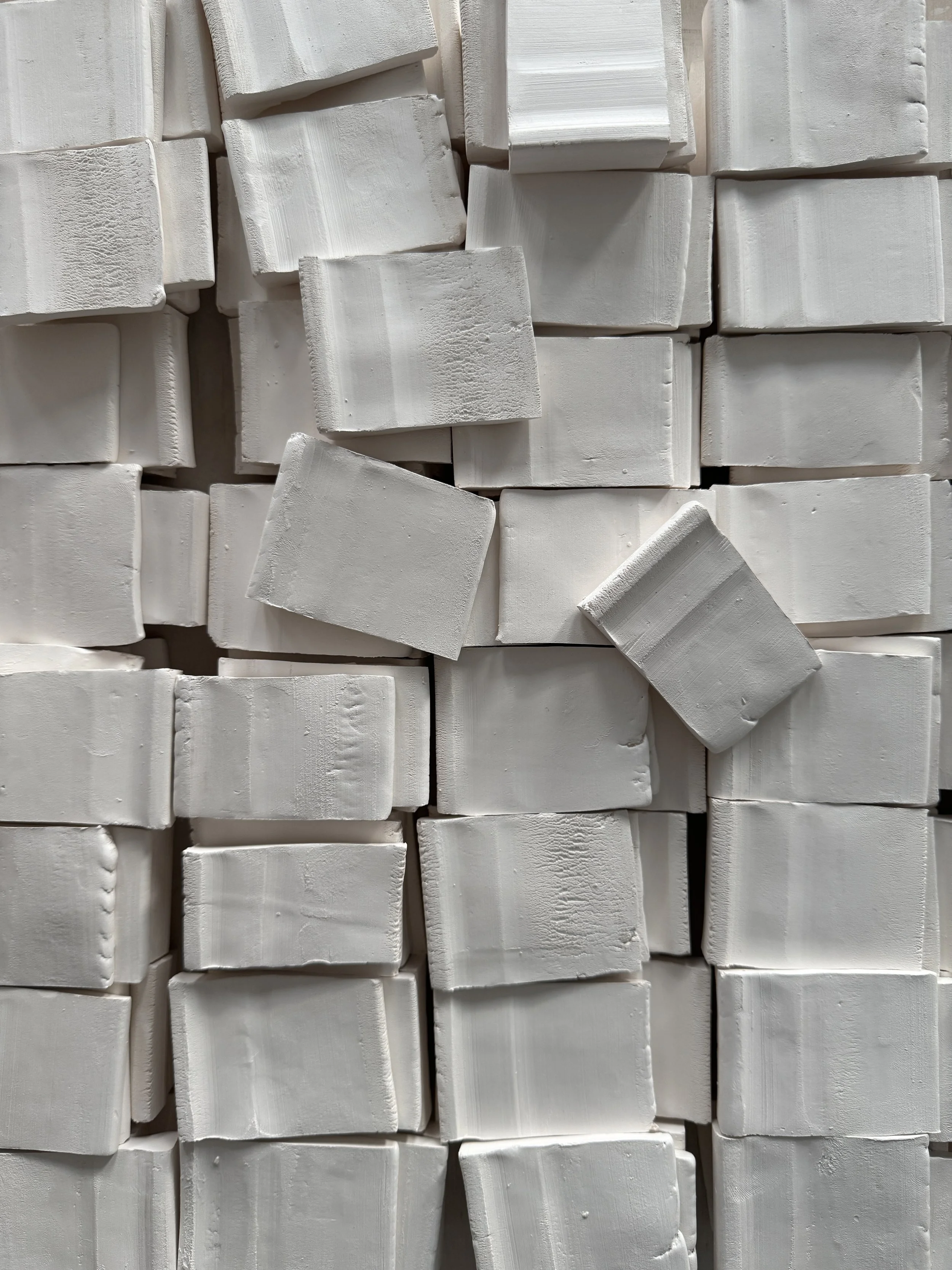
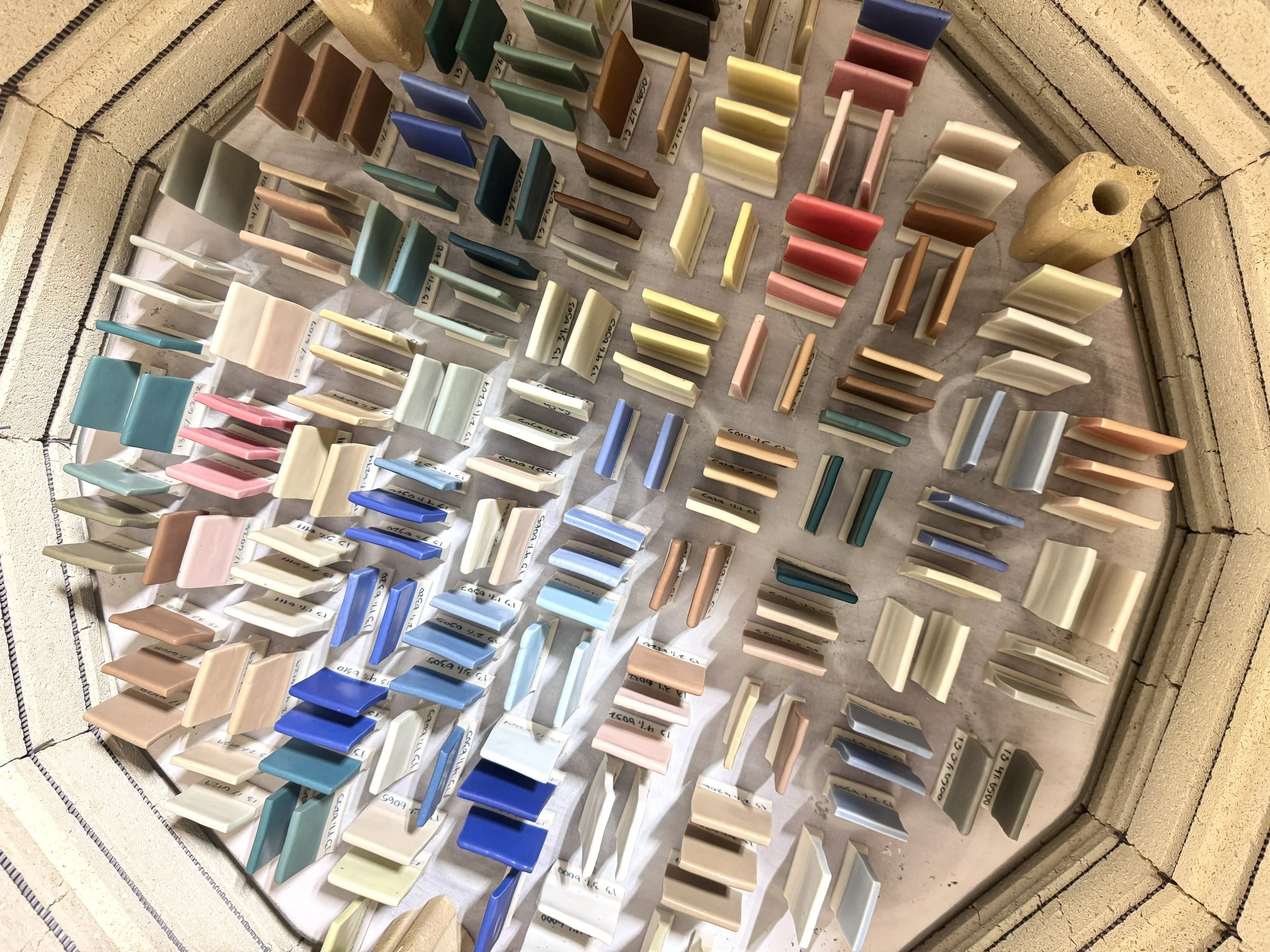
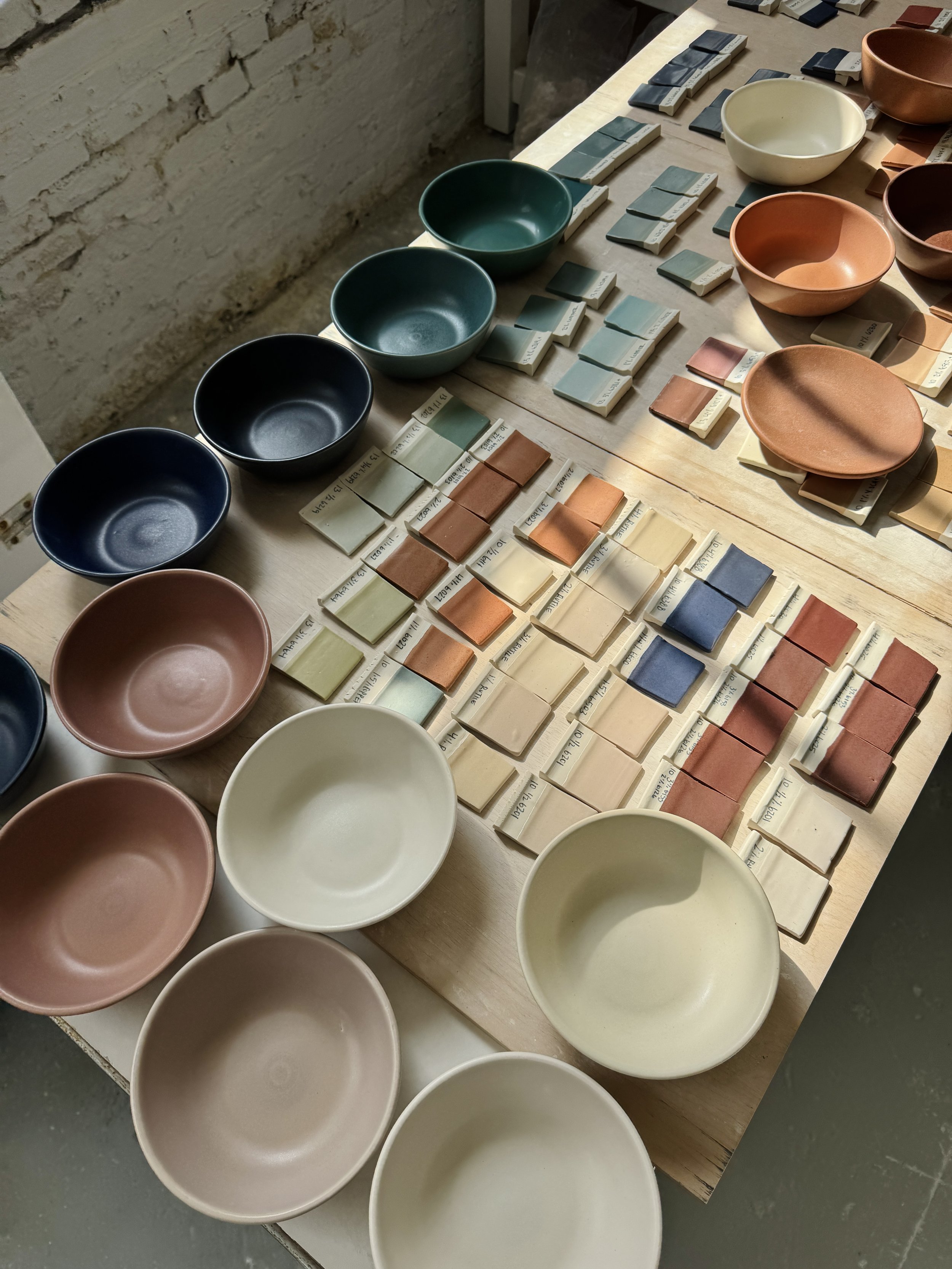
We keep two base glaze recipes that we trust completely. Those bases get tested against thirty or forty ceramic stains, and each stain gets stepped up in one percent increments through about five percent, one porcelain tile per recipe. That is several hundred unique glazes on a single board, and it is the closest thing we have to a Pantone book, except ours is made of fired porcelain. Eric and I built the whole thing in about six weeks last August and September, mixing every recipe by hand in micro batches, deli cups lined up across the studio. Which is to say we made it almost exactly a year ago this month. Every color we have released since came off that board, and so does every custom glaze we develop for a restaurant.
The board is not a record of finished work. It is a starting point. A tile on it is a color that exists and behaves, which is most of the difficult part, and what remains is refinement.
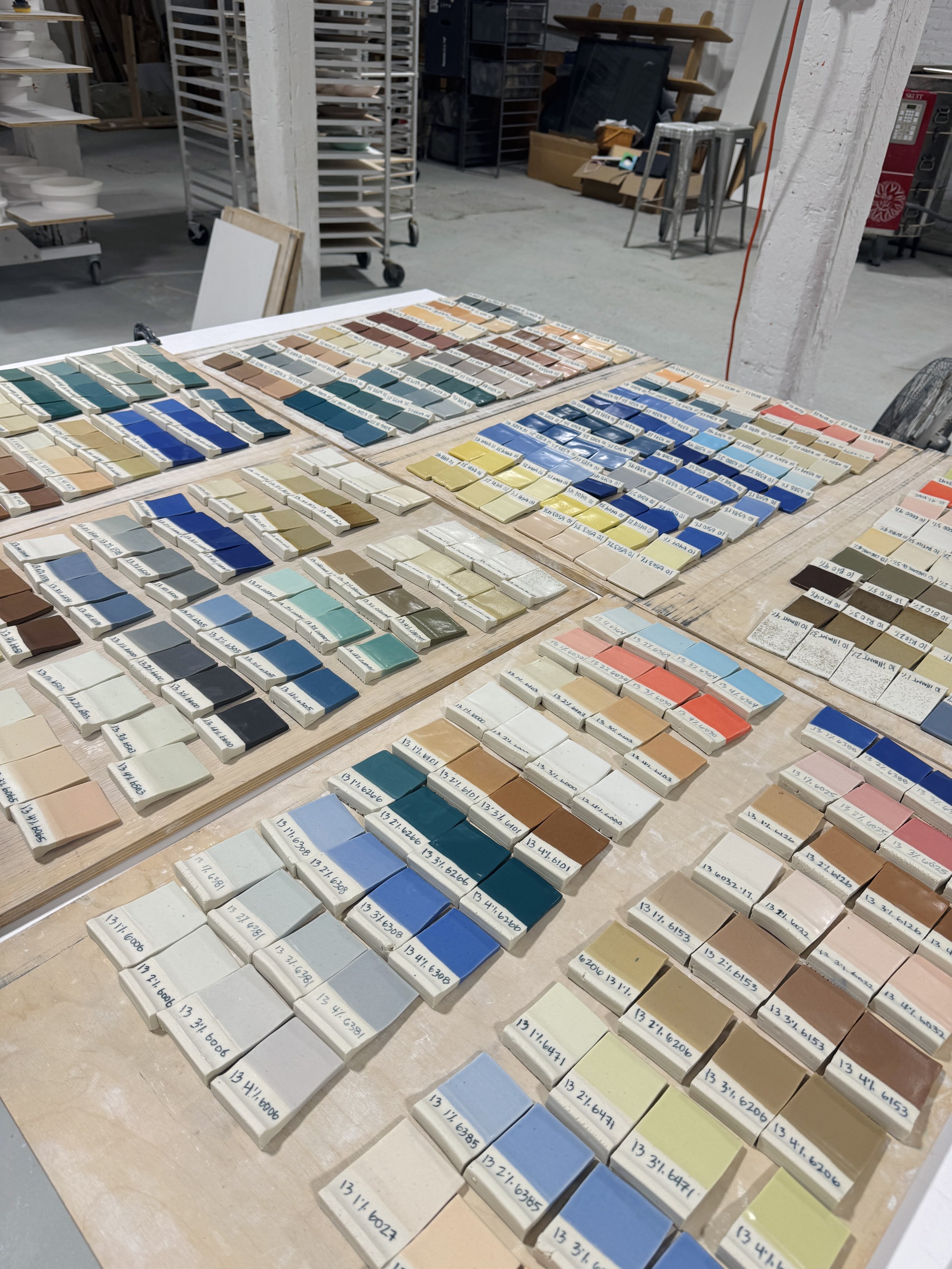
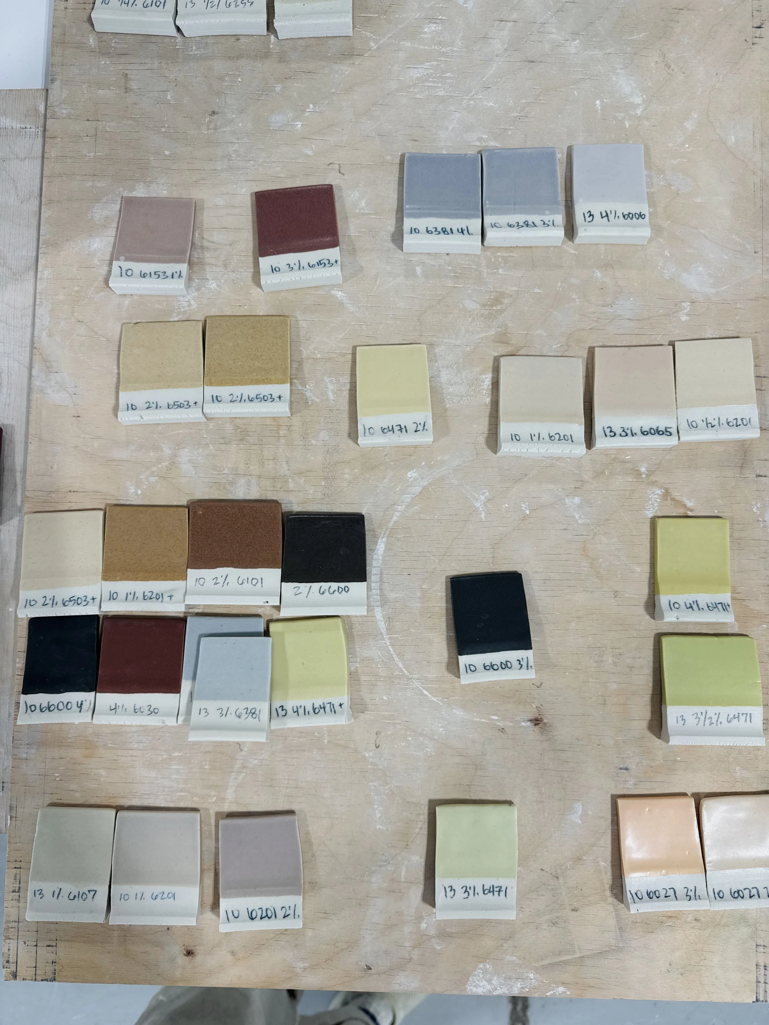
A year after the core palette launched, we went back to the board to build out the wider glaze palette we offer our restaurant clients. Eric and I pulled the tiles we had passed over the first time, the ones that were good but did not fit the six we were assembling.
Brandywine was one of them. Looking at it again with a year of distance, we both had the same reaction, which was some version of how did we walk past this. It was solid. No tuning, no reduced pigment load, no second round on a bowl to see whether the color would survive a curve. We scaled the recipe up and put it straight onto Morsel Plates, which is not how this usually goes.
What it looks like
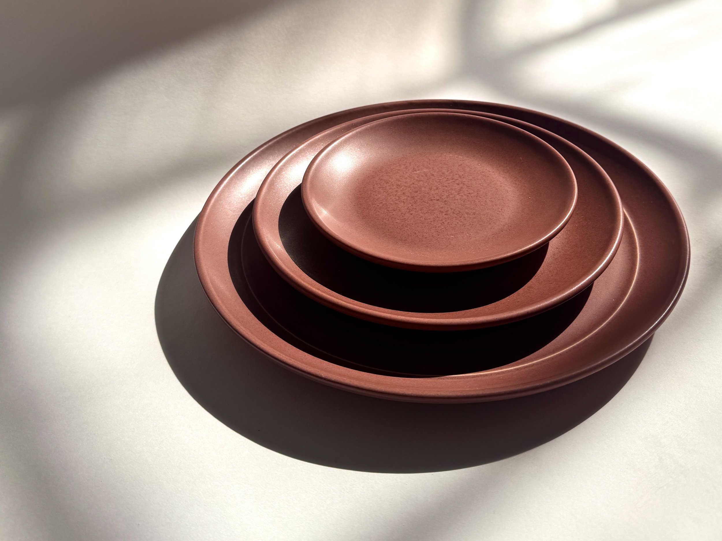
Brandywine is a rich red that stops just short of burgundy. Dusty rather than bright, warm without going orange, deeper than a blush. A fine speckle runs through it everywhere, and where the glaze goes on a little heavier it dapples light and dark across the piece.
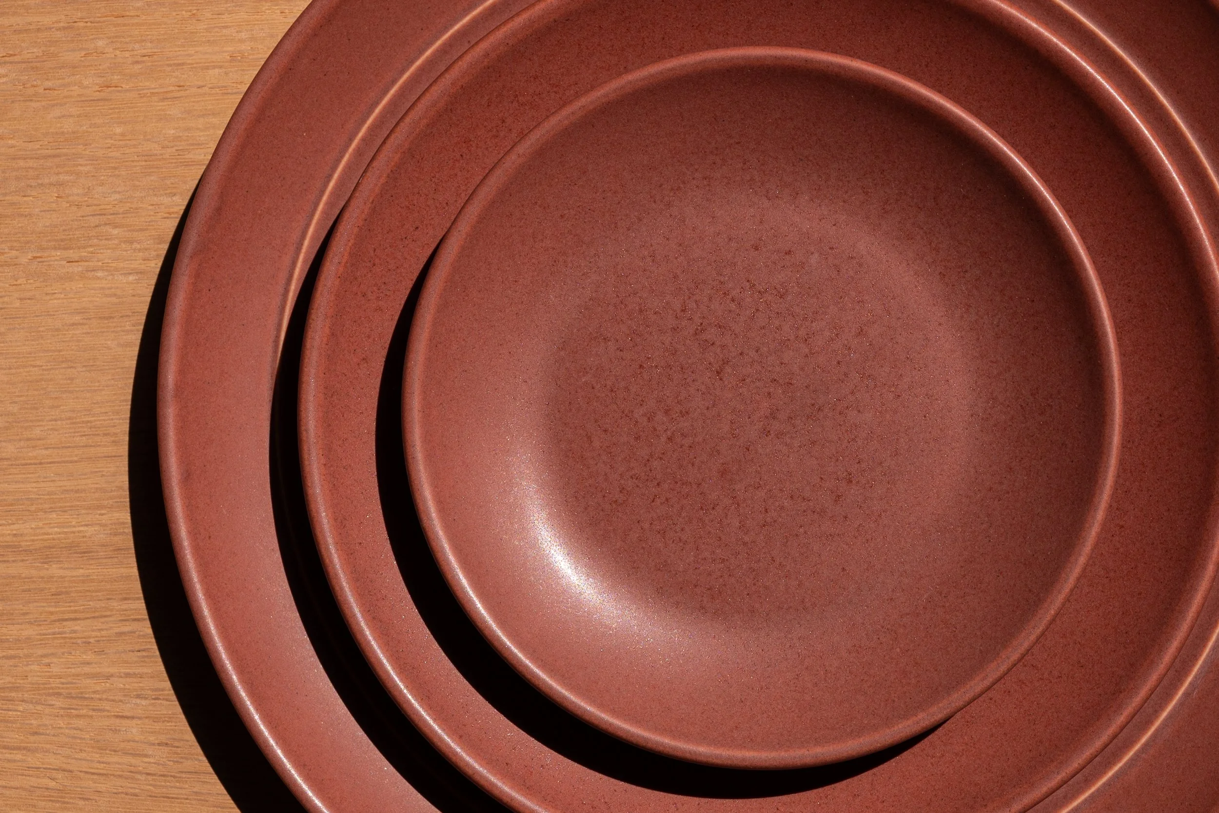
Close view of the Brandywine glaze surface, showing fine speckle and dappled color.
We call the surface satin matte because it is the closest available word, but paint vocabulary does not quite reach what our glazes do. Our finishes are mineral. They catch light in a gritty, low shimmer rather than returning it evenly the way a paint sheen does, which is why the same plate reads differently in morning light than it does under candles at dinner. Sheen is the hardest quality for us to put into words and the easiest one to recognize in the hand.
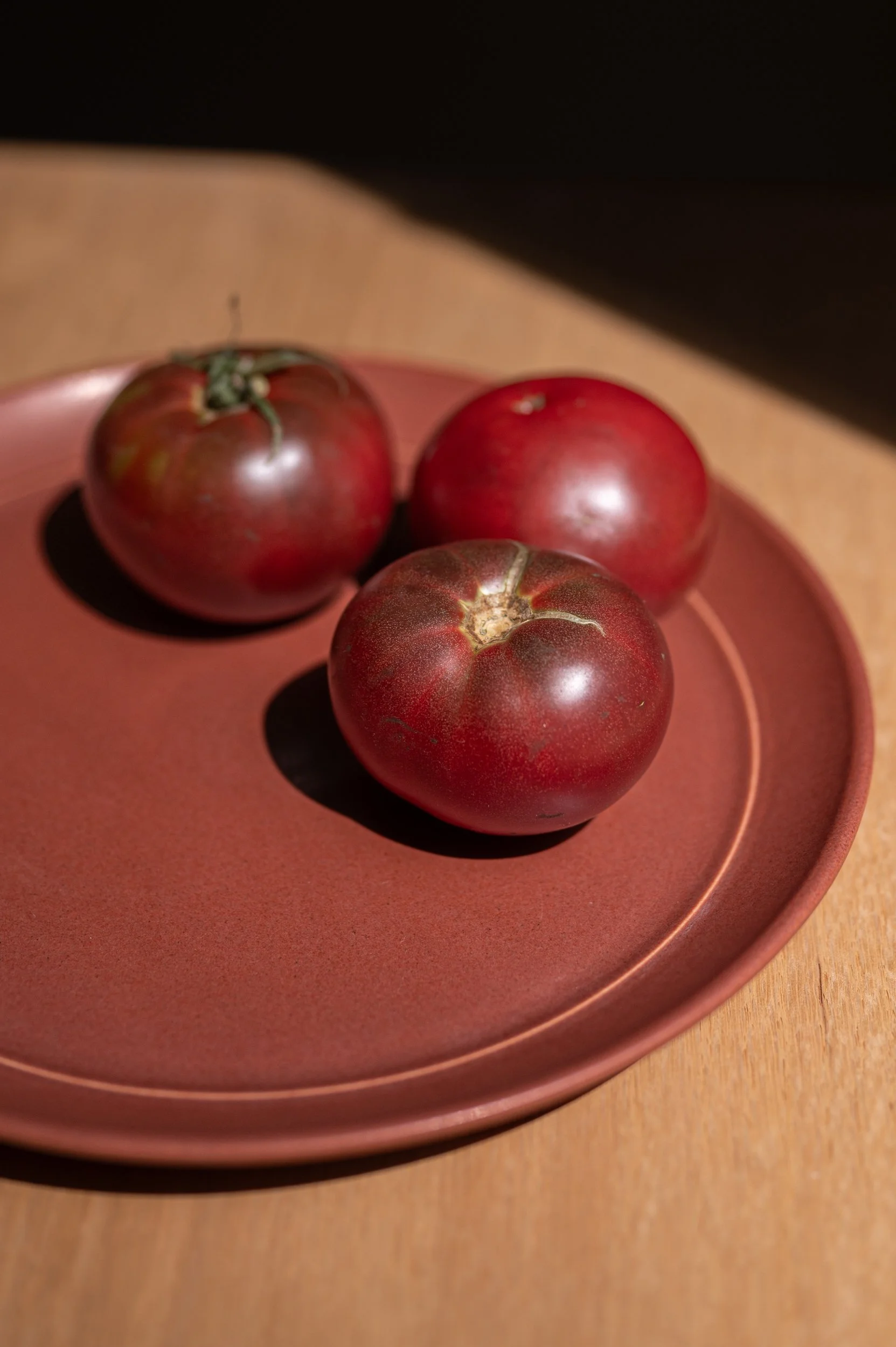
That speckle took us a while to place. What it reminds us of is the skin of an heirloom tomato. Not the flat, even red of a supermarket tomato, but the mottled thing that shifts pink to purple to green and never commits to one value. That is the quality we go after in every glaze we make. We like colors that live between the shades you already know, colors that take a second to read. If a color can be named in one word, it is probably not ours.
The name
The name arrived immediately, which almost never happens.
I am tomato obsessed. Growing them, eating them straight through the New England season into September, canning in the fall, then living on sauce I put up until it runs out sometime in February. The Brandywine is the heirloom I come back to every year, and it is the exact color of this glaze at peak ripeness, where the red turns toward brown.
There is also this. I grew up outside Philadelphia, where the Brandywine is a creek and a valley and a road sign you pass a hundred times without thinking about it. The word had been sitting in me a long while before the color turned up to claim it.
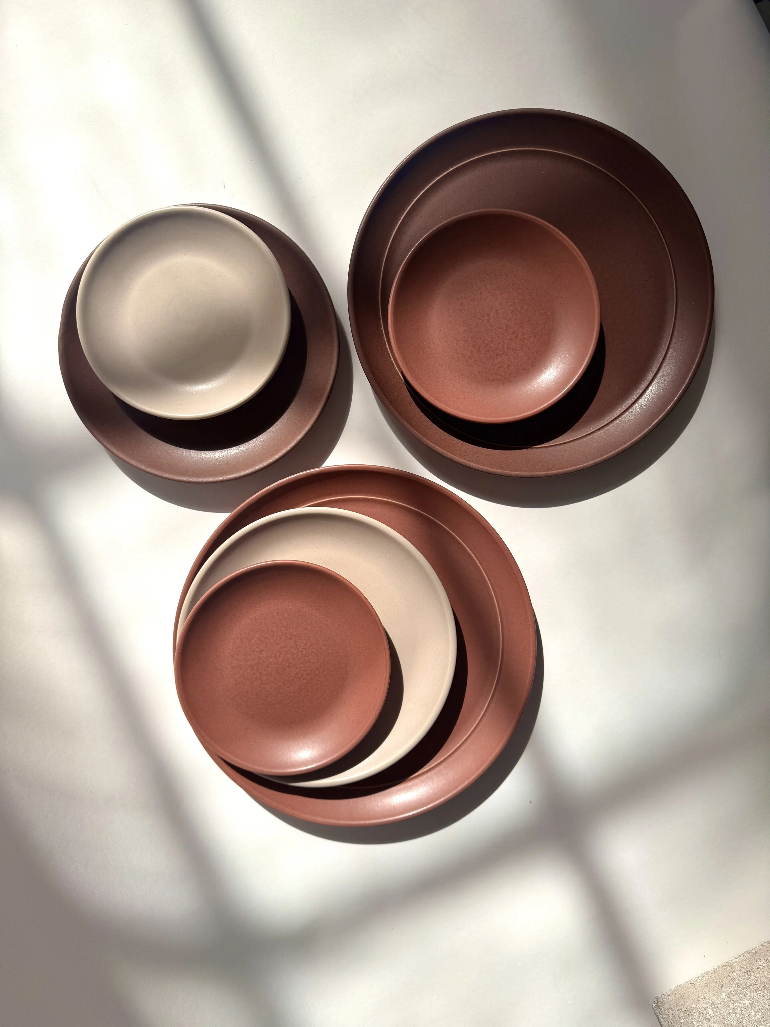
What to put it next to
We designed Brandywine to move into a collection you already own rather than start a new one.
Rosewood is its closest relation, which makes sense given where it came from. A warm brown with red underneath, set beside a red with brown in its depth. The two read as related rather than matched.
Dove works the other way around. Its warm grey carries a faint lavender that meets the pink in Brandywine. The two share a sheen, so the contrast is not finish against finish but surface against surface: Dove is even and quiet, Brandywine dapples and catches. Two kinds of light on one table.
Brandywine goes with everything in the palette. These two are simply where we would start you.
If you want the full picture of how our colors get made, we wrote about the glaze design process in detail last year: The Art of Glaze Design at Myrth.