The Art of Glaze Design at Myrth

Narrowing down our color directions from hundreds of options.
In our studio, the launch of a new collection is the culmination of months—and often years—of creative exploration and technical development. As we prepare to unveil our six new glazes, we want to share a look behind the scenes at the journey of designing and developing our ceramic glazes. It's a process that is as much an art form as it is a science, and it's a journey we're excited to share with you.
The Chemistry of Color and Finish
At its core, a ceramic glaze is a mixture of powdered natural minerals, rocks, and clays that, when fired, melt into a glassy coating. But to create a perfect glaze, we have to carefully control the chemistry within the mixture of these powdered minerals in each of our recipes. The process is a delicate balance of three primary components:
Silica (SiO2): This is the glass former, the backbone of the glaze. It’s what gives the glaze its glassy, durable nature.
Alumina (Al2O3): The stabilizer. This component prevents the molten glaze from running off the pot during the high-temperature firing.
Fluxes (e.g., Na2O, K2O, CaO): The melting agents. These are the workhorses of the glaze, lowering the melting point of the silica and allowing the mixture to fuse to the ceramic body. Different fluxes produce different effects, which gives us a range of textures, opacities, glaze mobility (flow during firing), and surface finish.
Before we even begin to think about color, we start with the base recipe trials. This is the first and most critical phase of our design process, where we create and test colorless white glazes. This allows us to focus entirely on key attributes like hand-feel, texture, translucency, and durability. It's at this stage that we ensure our glazes will hold up to everyday use—things like silverware marks and chipping from the occasional clumsy hand—for years to come.

Once we have several reliable, well-tested base glazes, we move on to color development. Color is created by adding specific ceramic pigments to our white base recipes. For example, we use copper to achieve beautiful teals iron for earthy browns and reds, and cobalt for deep blues. The kiln itself also plays a role in the final color, as the firing atmosphere (oxidation in our studio), temperature, and duration can dramatically change the final hue.
Finding Inspiration for Our New Colors
For us the color development process typically starts with a period of reflection: we review our current glaze colors to see what's working and what isn't, before diving into new inspiration. For this new collection, our inspiration came directly from the principles of biophilic design. This approach, which aims to connect people with the natural environment, is known to increase a sense of well-being and tranquility in interior spaces. It’s personal important to us and how we live in our home. We surround ourselves in natural materials like wood, stone, and plants to bring the balm of nature indoors. As new homeowners, we drew inspiration from the colors and textures of contemporary interior design, our home garden, and the coastal Rhode Island landscape we live beside. The play of light and shadow on a surface also became a key theme as we sough to up level our use of texture in our new glazes - a Myrth signature.
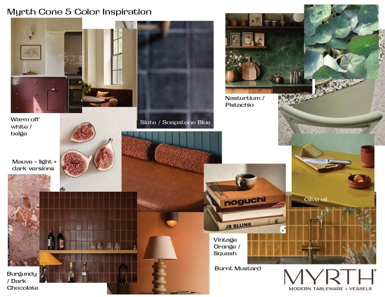
We typically make a quick mood board to make sure we’re aligned before starting color work.
From here we start to create broad color areas we would like to explore in our development work (see above). We rarely ever select a specific shade, like a pantone or paint swatch, to go after because we have found, in the decade or so we’ve designed glazes, that creating a very specific glaze color, is quite difficult, and honestly, exhausting. When we create color in the kiln it’s much like baking, and through time, temperature, and chemistry colors emerge. We love to start down a broad color path, like ‘warm greens’, then create recipes that we think will get us in the ballpark. As samples emerge from the kiln, we study them, tinker and iterate until we have a new shade that’s exciting to us. The process is what helps us determine what our new colors will be.
Our new palette inspiration focused on sophisticated and rich shades that were slightly less saturated as compared to our retiring colors. We also sought to incorporate intriguing textures and surface variations. We always strive to design chemistries and colors that are unique to Myrth. They may not follow a trend or fad but will compliment your interior with ease and timelessness and create a sense of soothing and enjoyment.


Testing and Refining
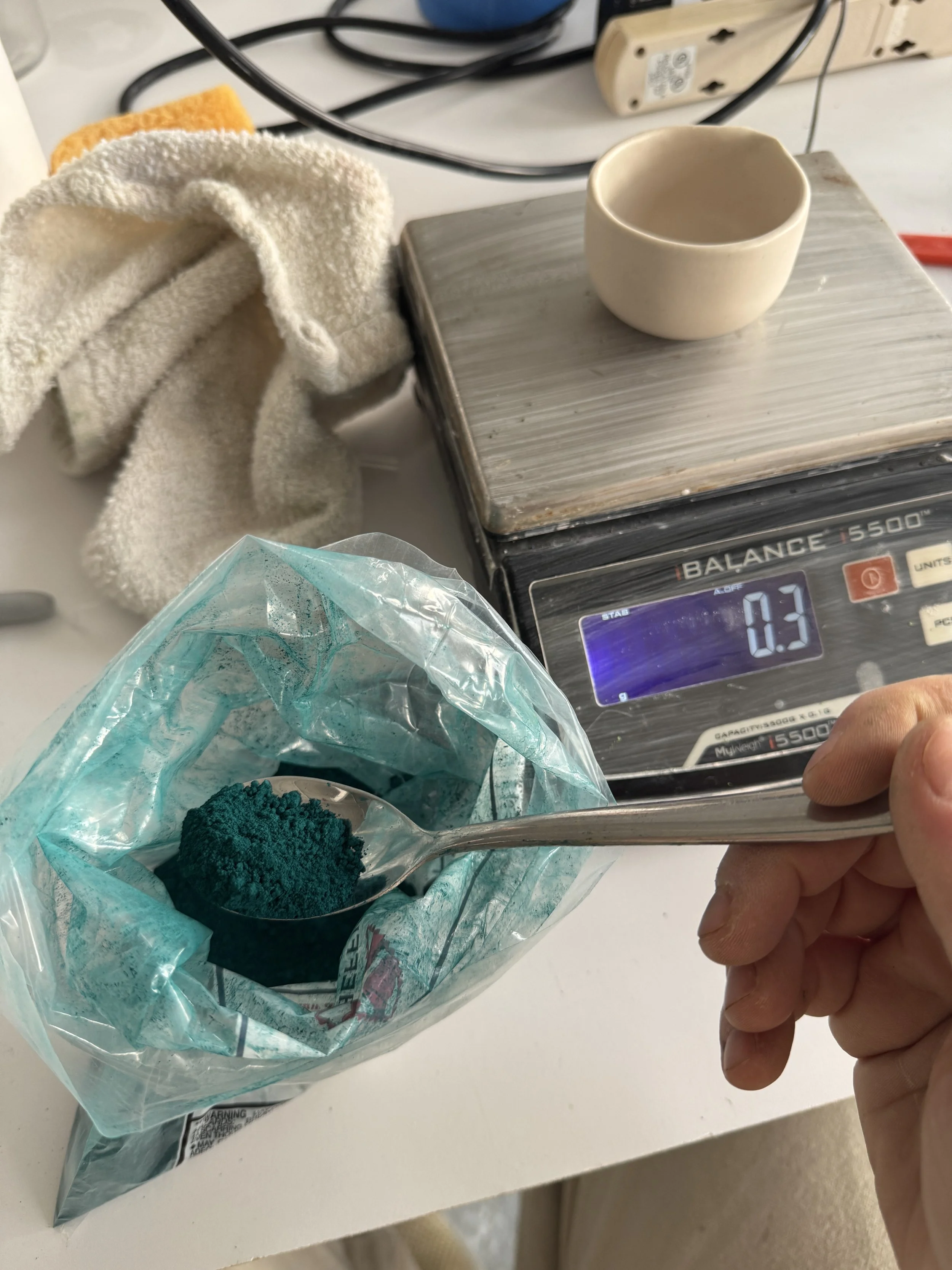
As we touched on above, developing a new glaze is an iterative process of testing and refining. It all begins with the meticulous work of weighing and mixing raw materials to create small test batches of liquid glaze (about half a pint), using lab scales measuring to the tenth of a gram for pinpoint accuracy. We add powdered colorant to our white base recipes in increments of 1% of the batch then dip a single porcelain tile into each of these sample glazes. This initial phase creates a sort of master color palette of glaze tiles, like a pantone library but of ceramic glaze. This first round of development netted over 450 single glaze color tiles! It’s an exceptional starting point for our development work — so many options!

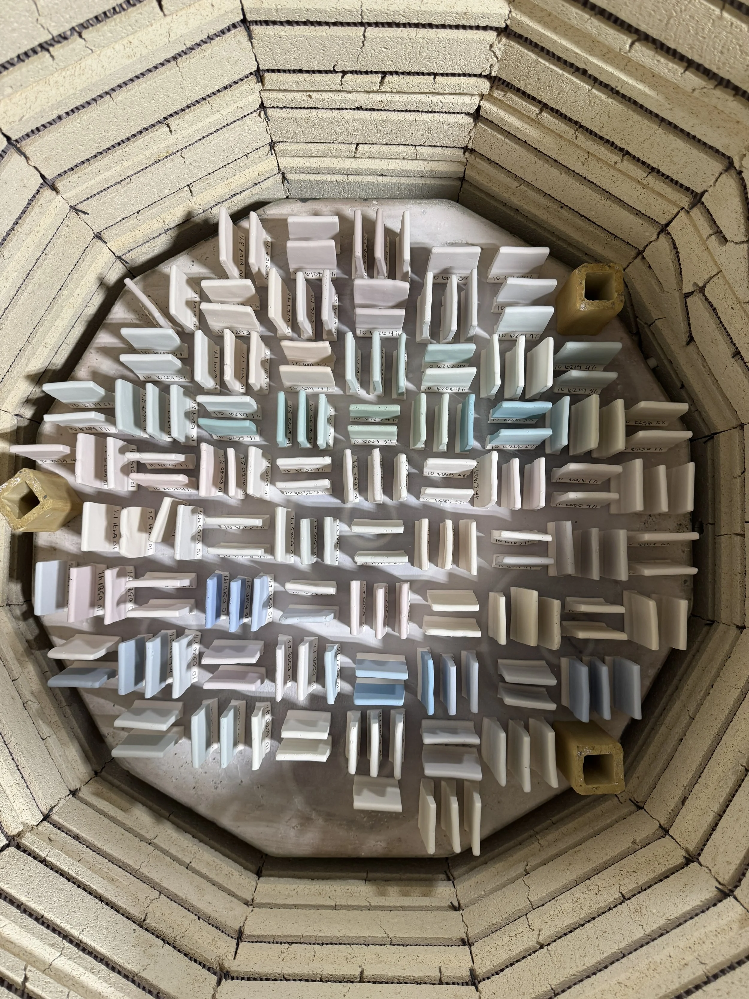
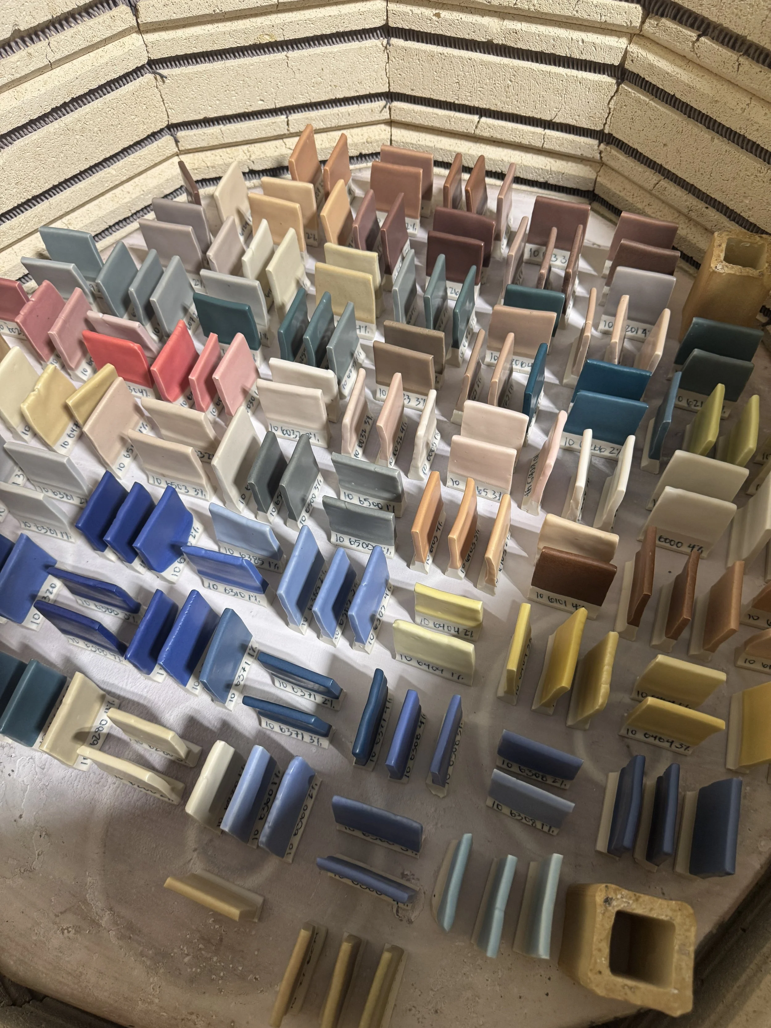
Within this massive amount of sample glaze tiles we begin to see interesting colors and textures emerge and the real development work begins. We will select tiles matching our initial inspiration and others that are positive surprises. These will progress to the next round of development where we begin to combine multiple colorants in each glaze recipe. We call this ‘color tuning’ and it’s how we make colors that are unique to Myrth. This phase of testing with multiple colorants may go on for a few weeks, or in this case, another 400 sample tiles.
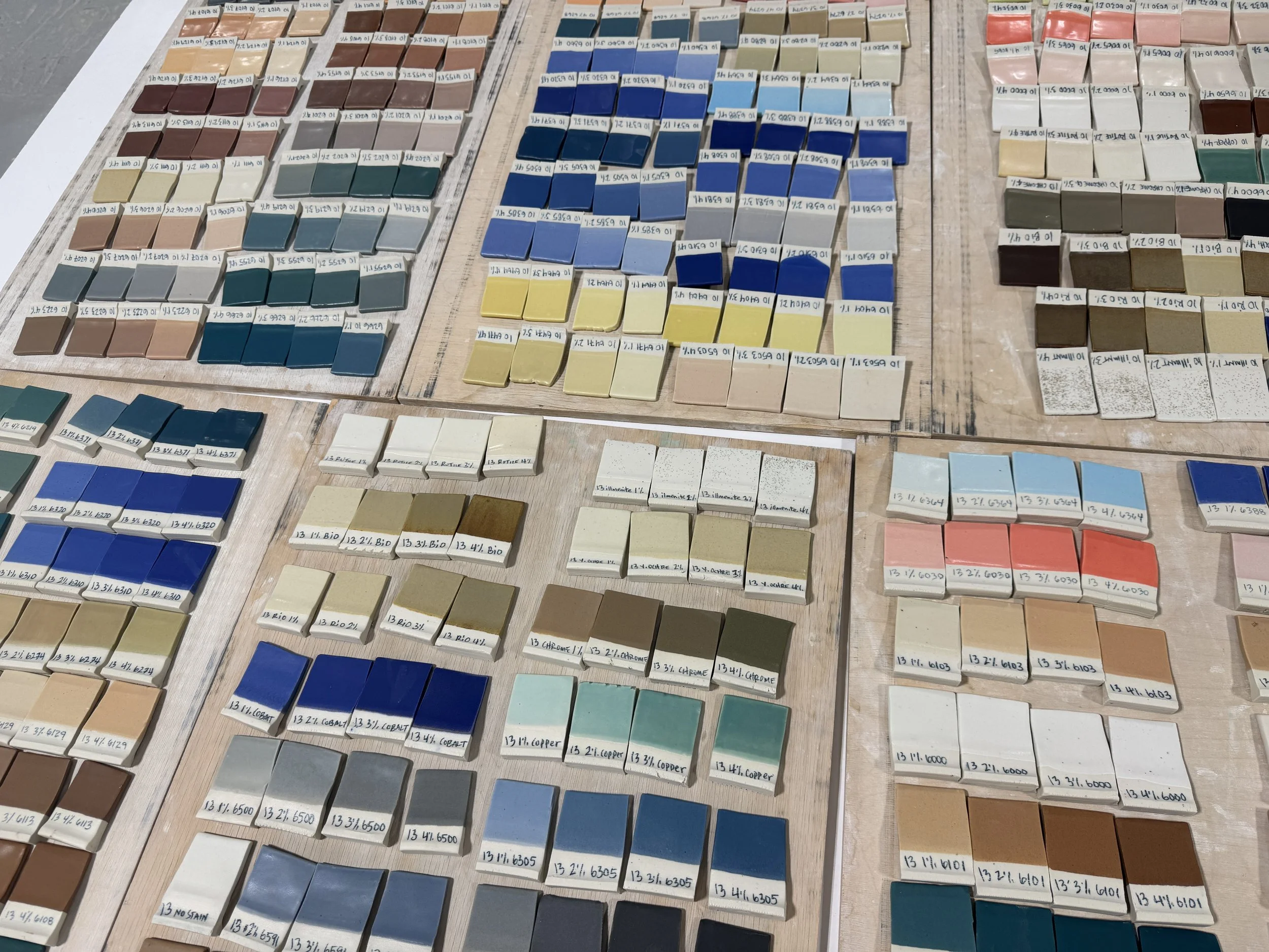
A portion of our master color palette. They may look like finished glazes, they are just the start of new colors.
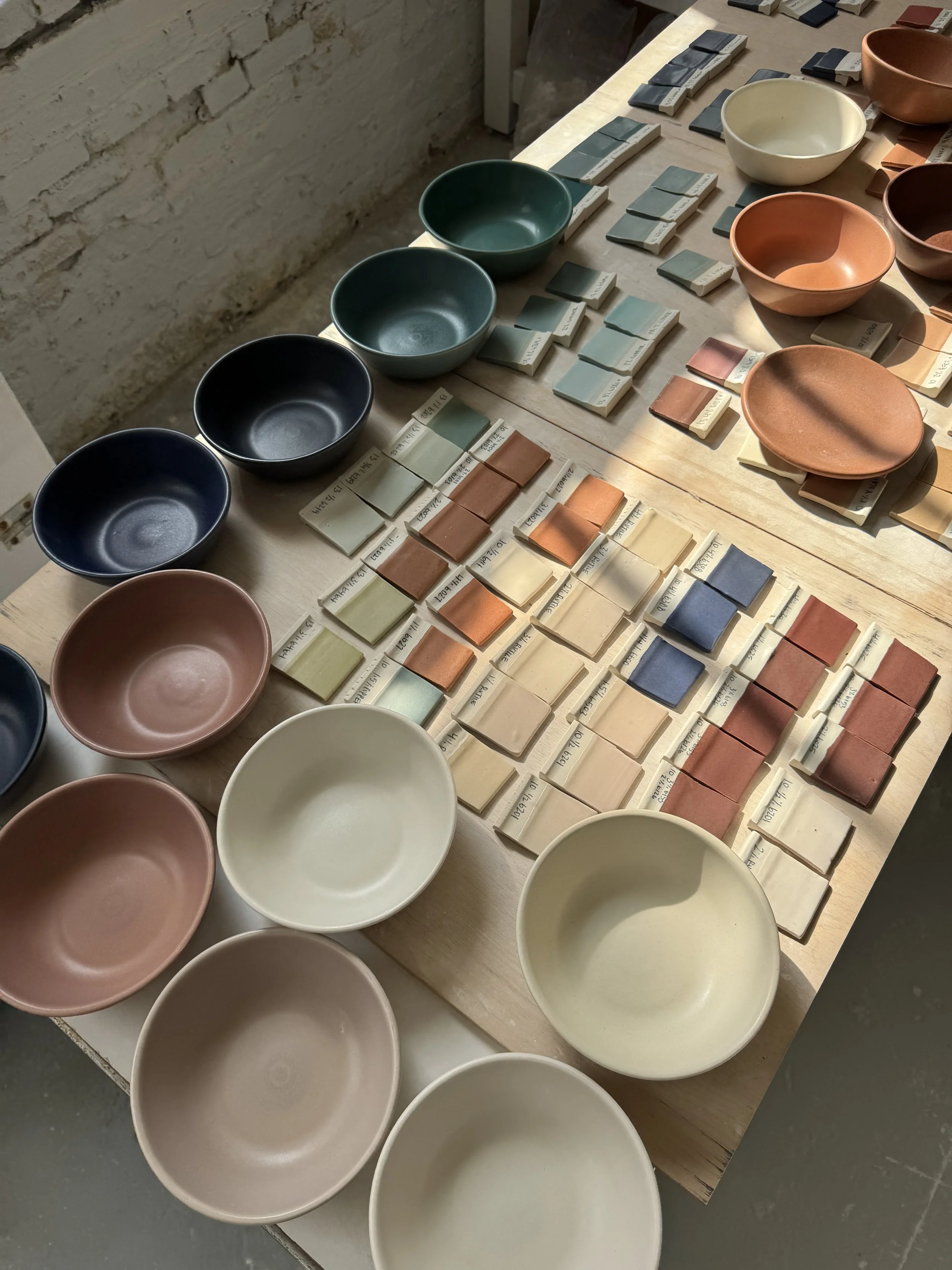
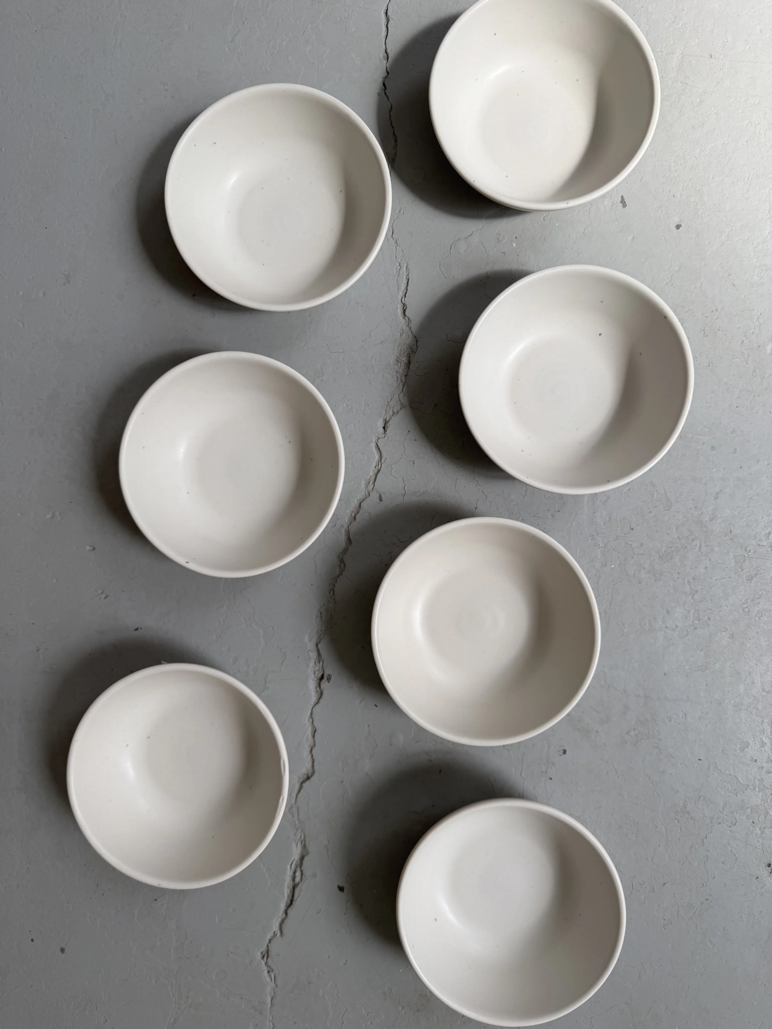
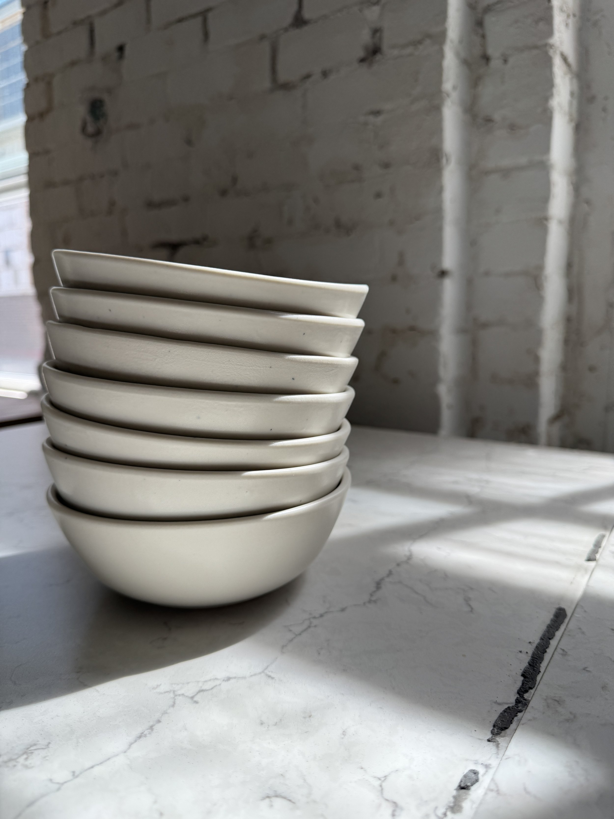
Narrowing in on our new colors and moving to bowl samples.
Once we we’re happy with how a color looks on a tile, we will scale a recipe up to a larger batch and apply it to a bowl to see how the color performs on a more complex shape. This step often reveals a need for adjustments—the color might be too bright or too saturated, or too flat and unexciting. We may reduce the pigments and or add other minerals to increase texture, bringing the color to life. Each of our new glaze colors goes through this exact testing process which can take days, weeks, or sometimes end development of a color that we cannot achieve.
For our new palette, about half of the colors were early successes that only needed a couple rounds of sampling on bowls. The other half took weeks of tinkering and retooling, and there was one color we had give up on for later development.
Conclusion
Ultimately, glaze design is a delicate dance between chemistry and creativity, driven by careful control and punctuated by happy accidents. It's a journey we embrace with every new collection, and one we absolutely love, despite the painstaking and often frustrating nature of the process. This dedication reinforces our commitment to true craftsmanship: ensuring a glaze’s aesthetic beauty—its unique hand-feel and visual richness—goes hand-in-hand with its durability. The result is tableware that is truly built to last. We can't wait to share the final results of this work with you very soon! Stay tuned for the launch, and thank you for following along on this creative journey with us.