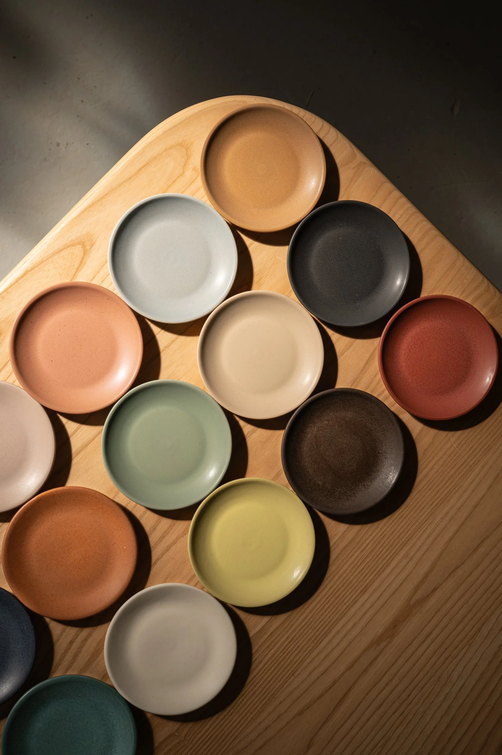
Every Myrth glaze is developed from scratch in our studio — raw materials, micro-batch testing, dozens of firing cycles before a color makes it into the collection. The result is a palette with genuine depth and surface quality that holds up in professional kitchens and reads beautifully under dining room light.
Hospitality clients have access to our complete glaze offering: six Core Colors available across our full retail line, plus nine glazes developed exclusively for trade. All 15 are available in any product, at the same pricing and lead times.
Hospitality Palette
Core Colors
Available to Retail + Trade
-
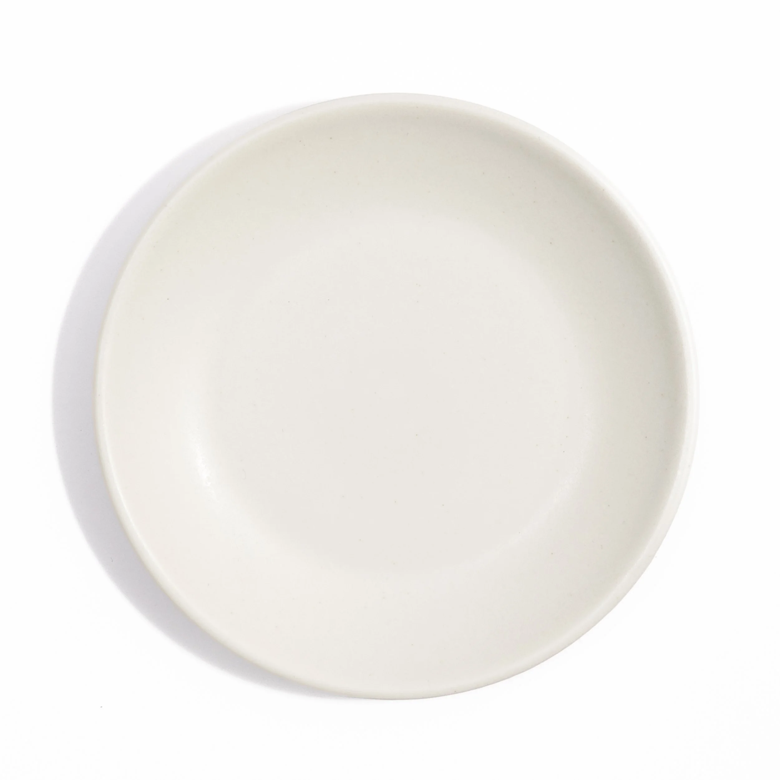
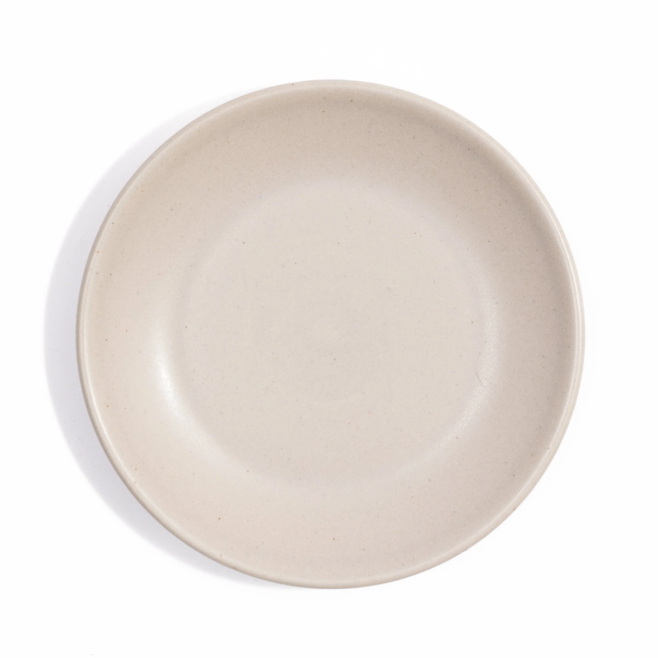
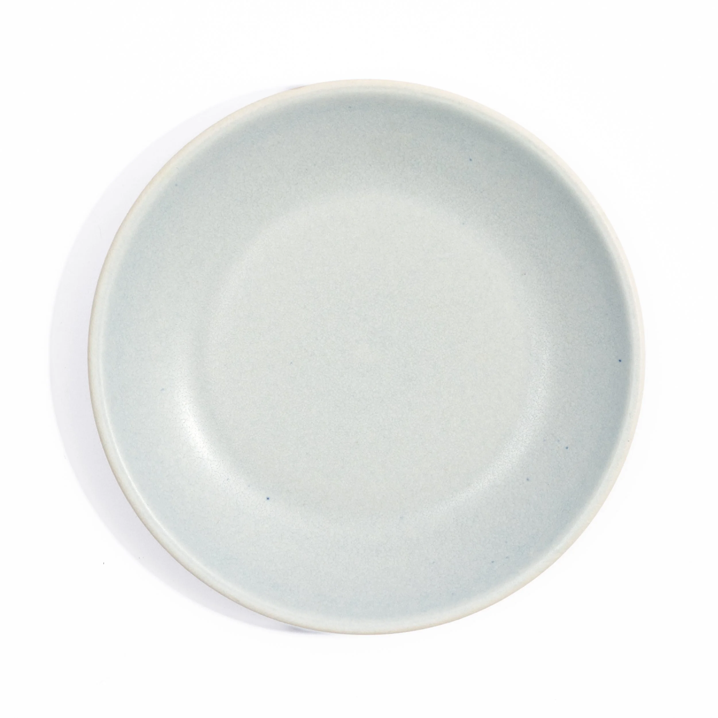
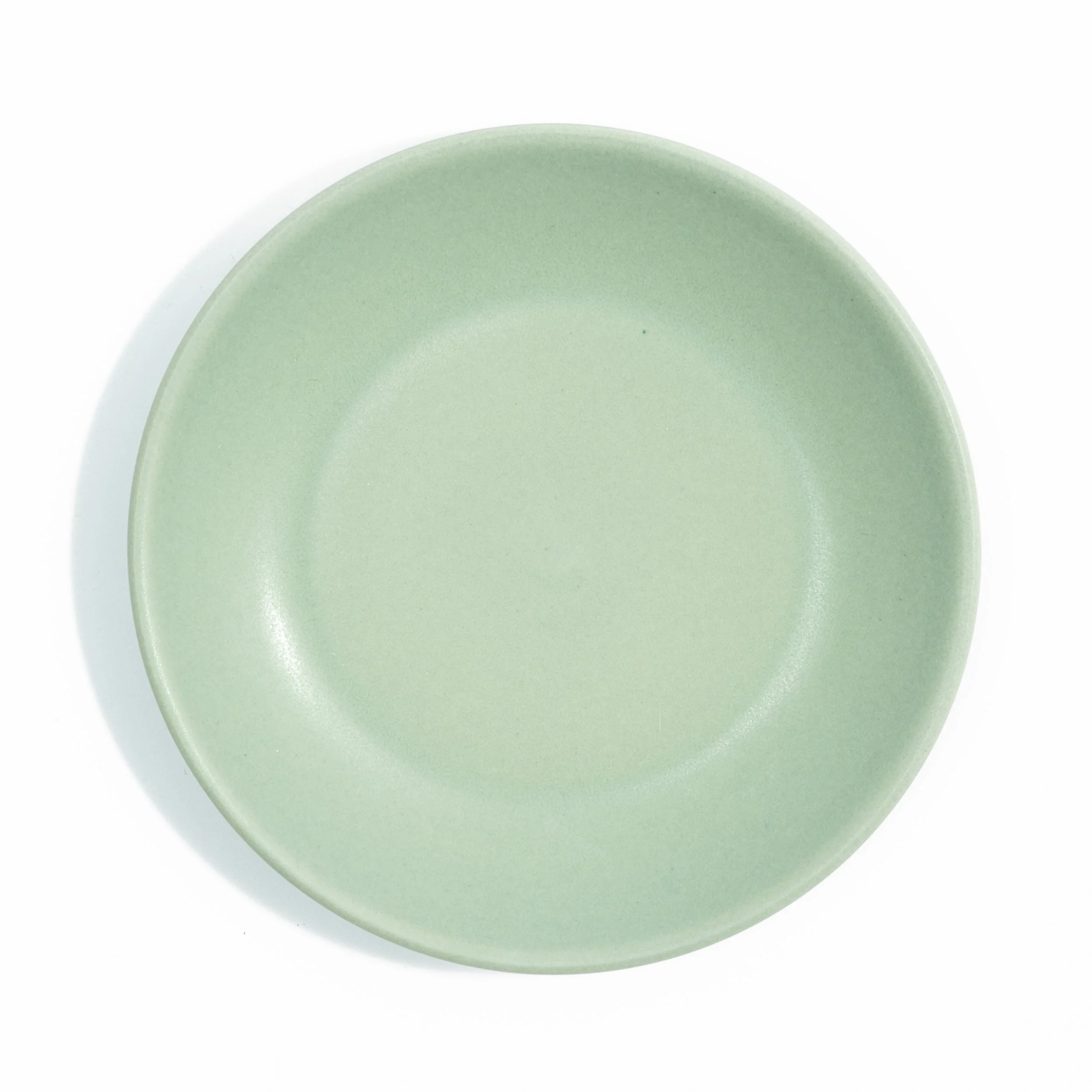
MOONLIGHT
Warm off-white with a satin matte finish. Absorbs light softly rather than reflecting it. The most versatile neutral in the collection, present on a table without competing with food or other glazes.
-
VERDIGRIS
Blue-green with a dappled gloss patina texture that shifts with light, cooler in daylight, warmer under incandescent. Up close the surface has a geological depth, like aged copper. Our most visually complex glaze in person.
-
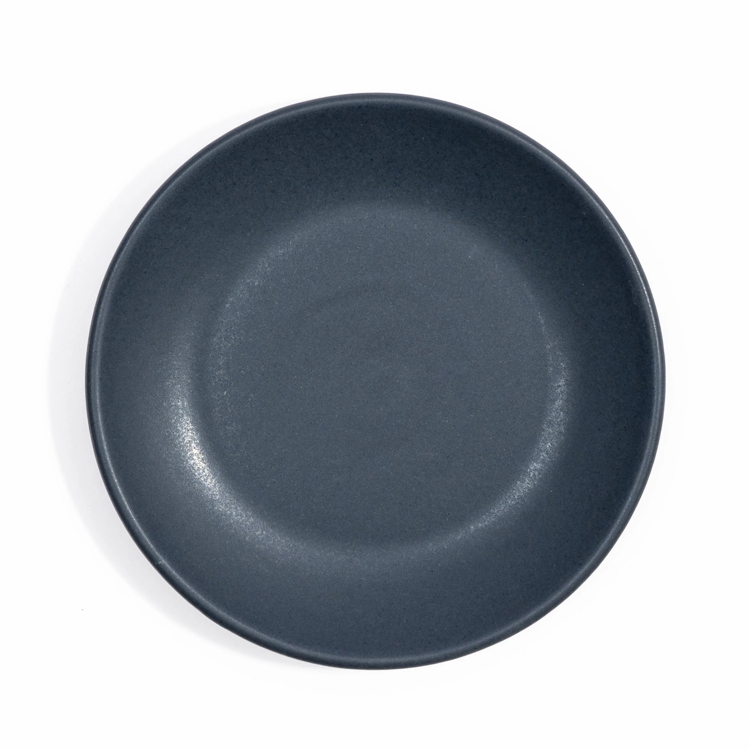
NIGHTFALL
Deep navy over a satin base with a dappled gloss speckle, small areas of higher gloss that catch light differently from the surrounding surface. Near-black in low light, distinctly blue in natural. Grounding on a table, striking up close.
-
DOVE
Warm grey with subtle lavender undertones and a satin matte finish. Reads as neutral in most light but adds something you can't quite name. Works equally well alongside the warm glazes and the cool ones.
-
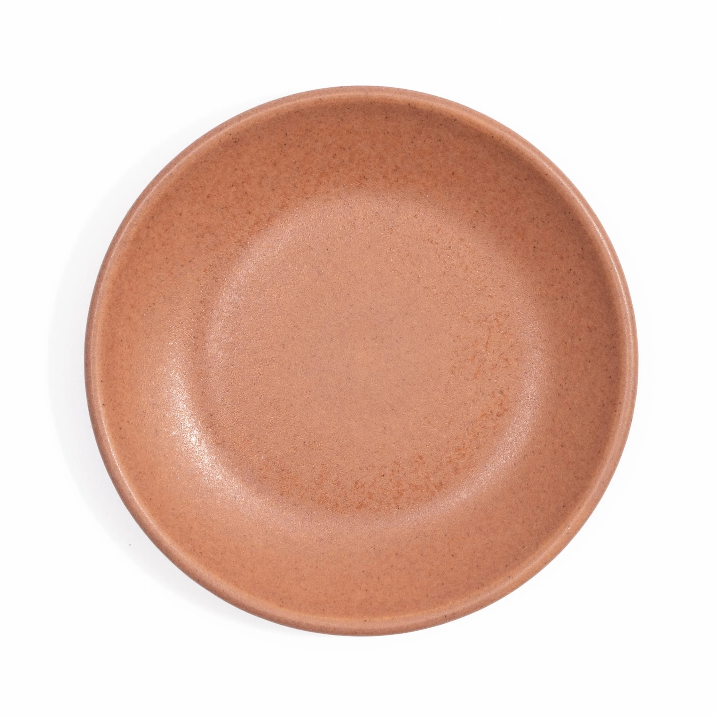
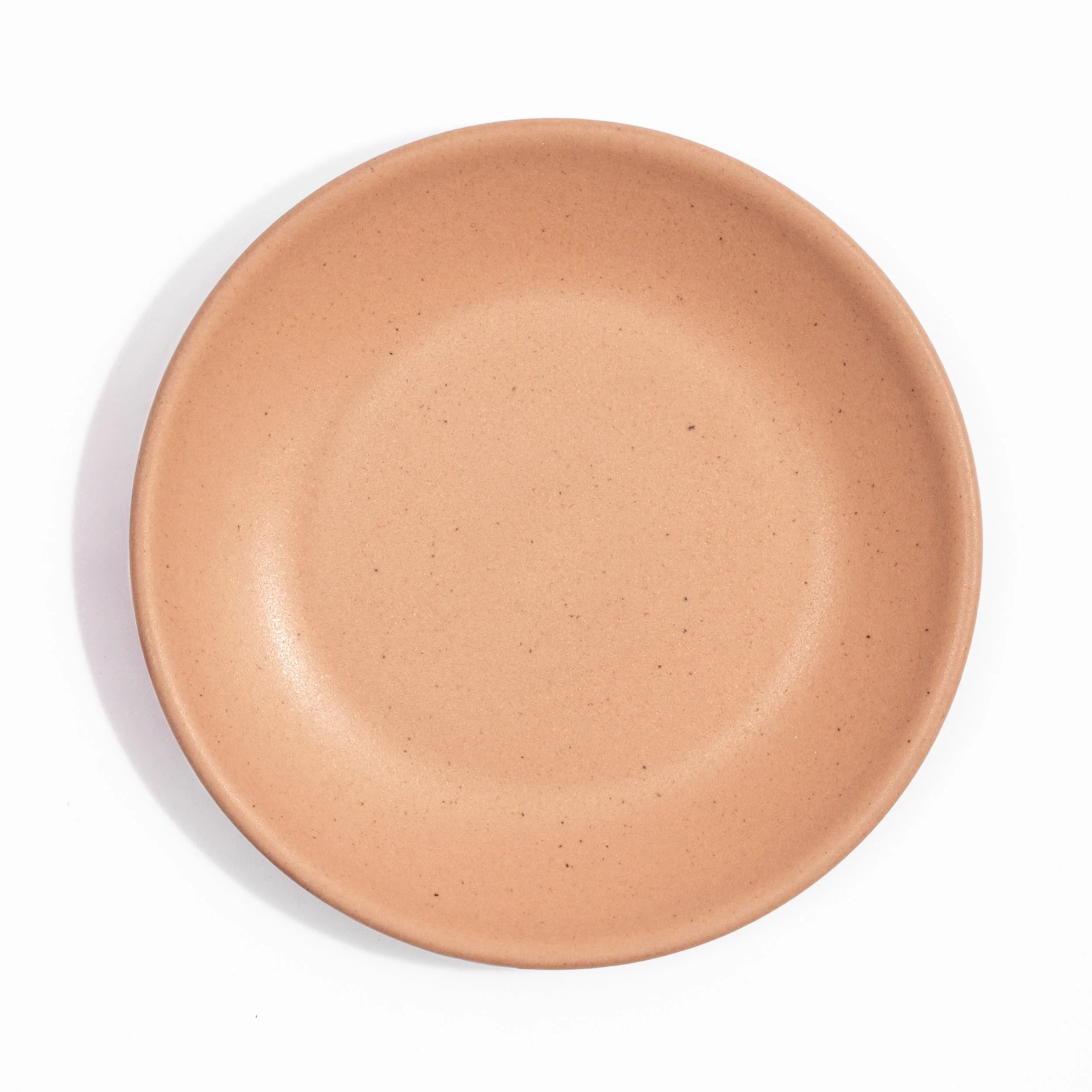
CANYON
Warm terracotta with a fine umber speckle across a satin matte surface. The speckle varies naturally from piece to piece, so a mixed table of Canyon reads as alive rather than uniform. Earthy in natural light, picks up red warmth under incandescent.
-
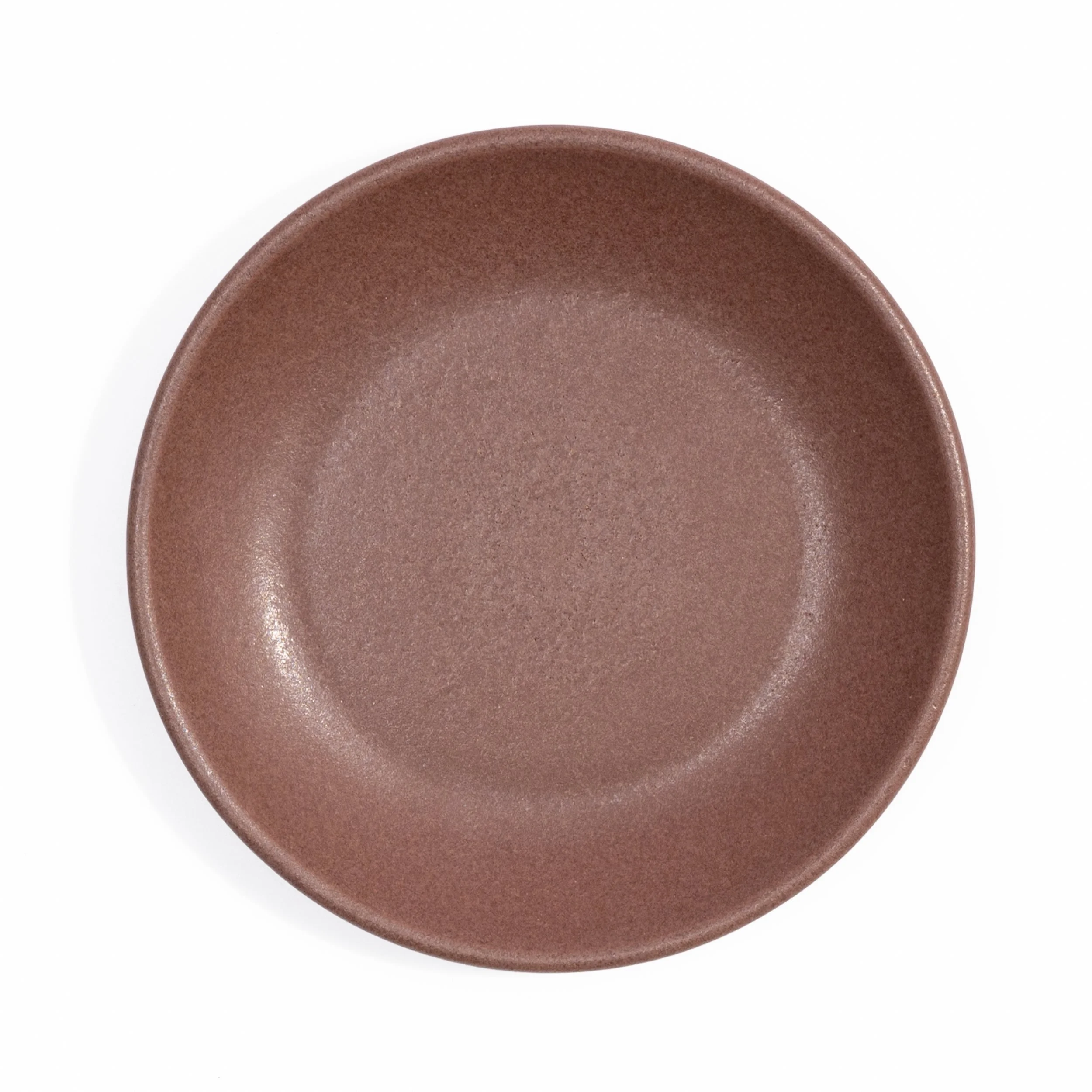
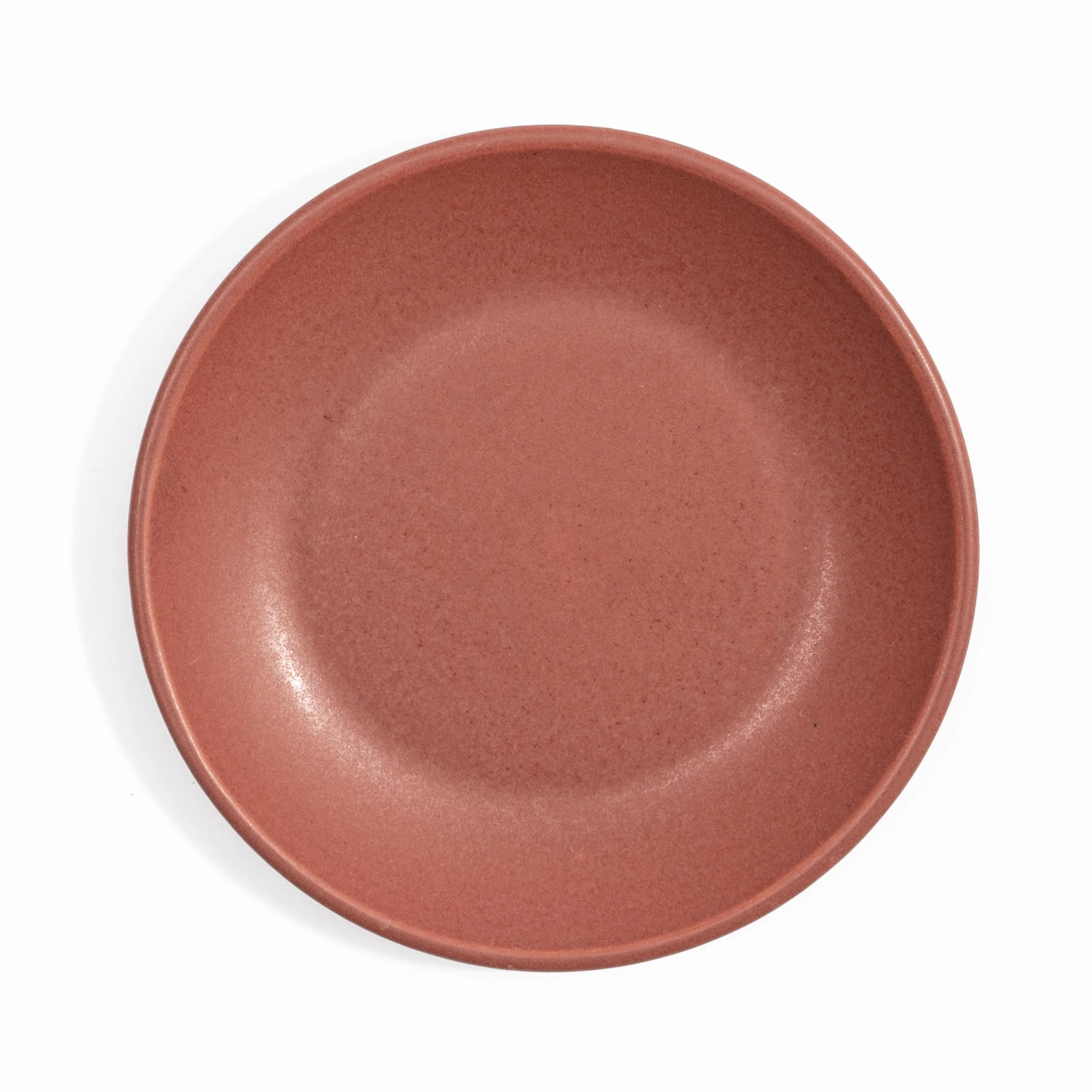
ROSEWOOD
Warm cocoa brown with red undertones and a textured soft gloss finish. Where the glaze thins at the rim it breaks to a thin copper-rose line. Velvety in low light, warmly luminous in natural light.
Trade Glazes
Trade Only — exclusive to hospitality clients
-
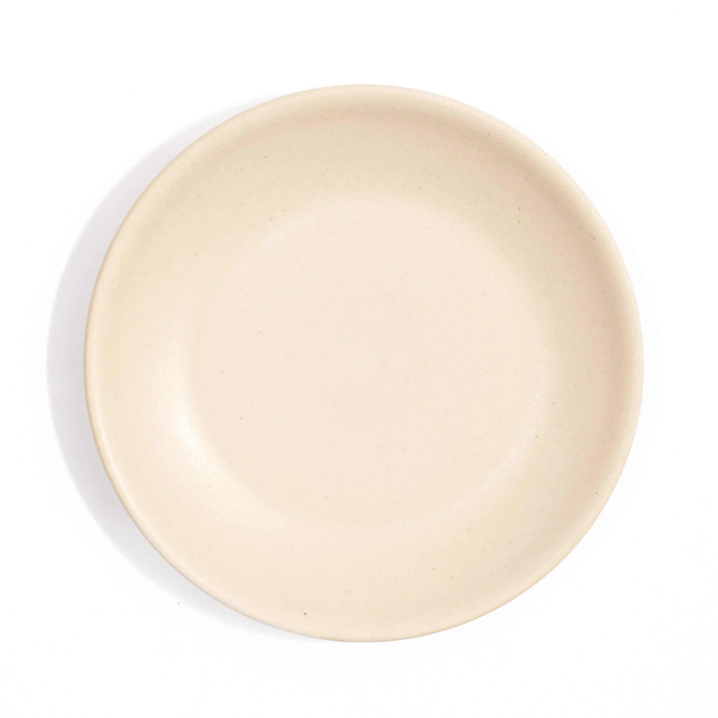
ROUX
Pale warm cream with a satin matte finish and a fine speckle barely visible at distance. Warmer than Moonlight, with a slight golden undertone that reads as ivory in natural light. The color of a blonde roux just off the heat. Unpretentious and highly versatile.
-
BRINE
Pale blue-grey with a soft satin matte finish. The palest and coolest glaze in the collection, with just enough blue to distinguish it from grey. Reads almost silver in low light. A strong canvas for delicate plating.
-
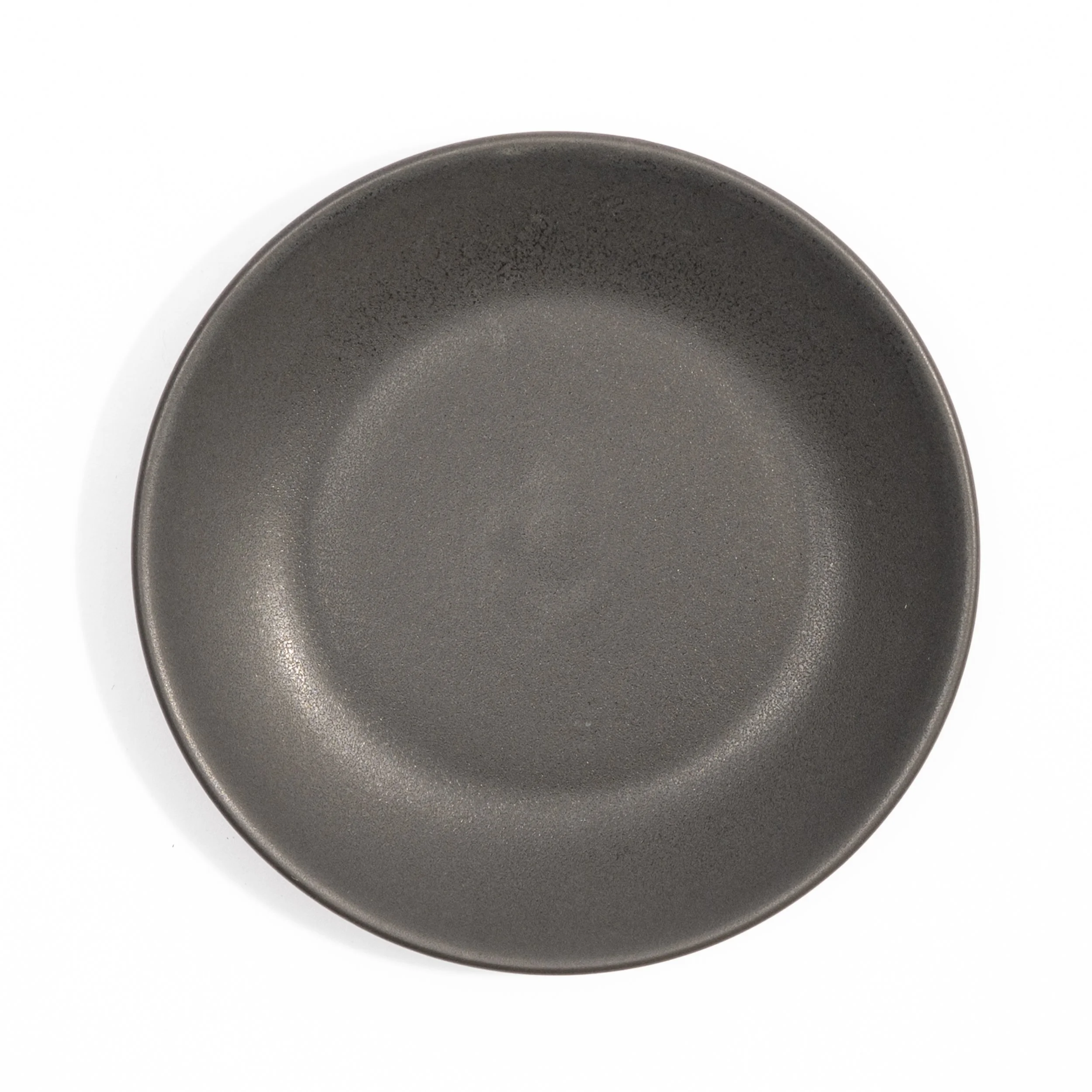
CHAR
Deep charcoal with a dense matte finish and fine surface texture throughout. Nearly black in most light with neutral undertones that keep it from reading as either warm or cool. The glaze chefs ask for when black is too much — close, but with more presence on a table.
-
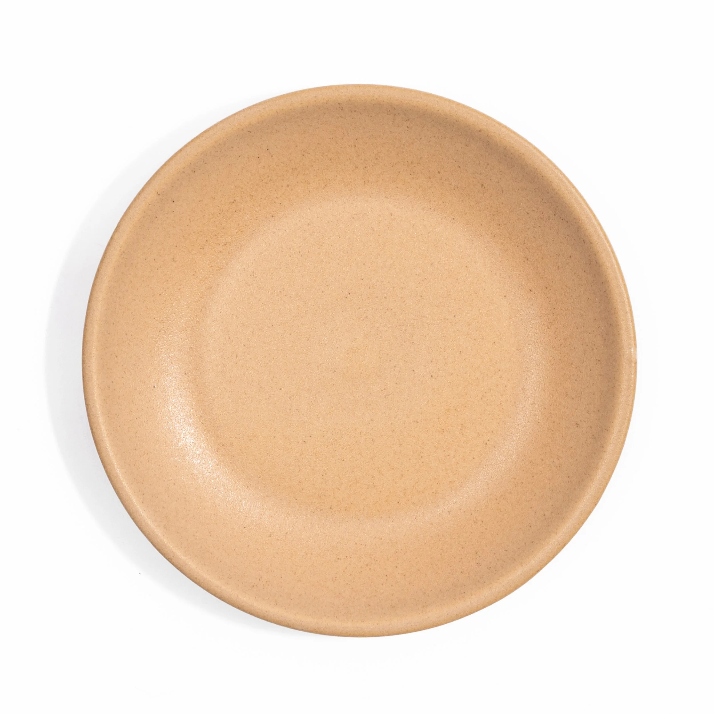
MISO
Warm amber-tan with a soft speckle and a satin finish that develops subtle depth up close. The color of a well-developed shiro miso, that particular golden beige with warmth underneath. Sits naturally alongside earthy and neutral glazes without pulling attention.
-
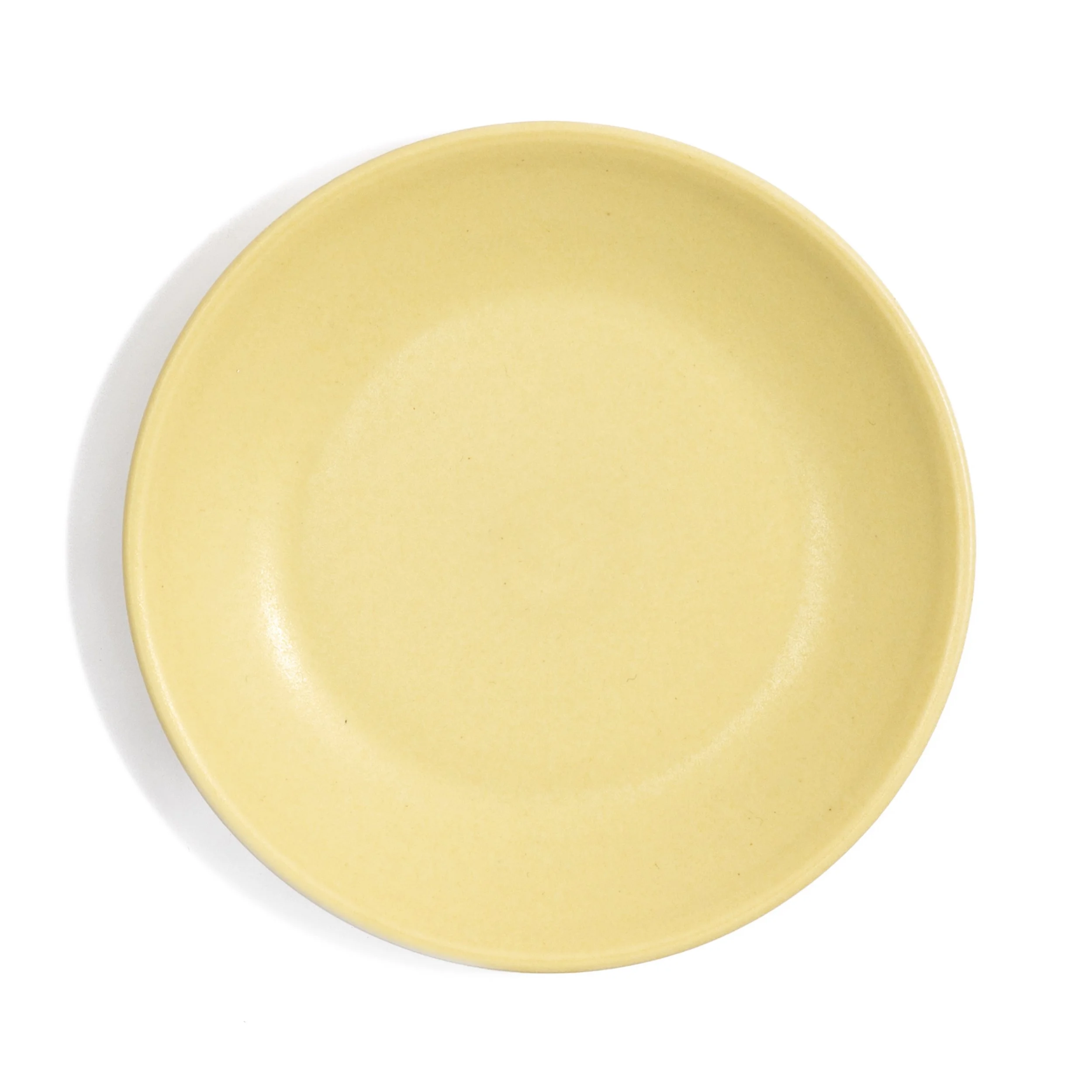
UME
Luminous pale chartreuse with a smooth satin finish. Named for the Japanese ume plum, this is the color of the unripened fruit — the yellow side of green, before it blushes peach. Bright without being sharp, it lifts a table setting and makes the colors around it read more vividly. Available as a Studio Edition alongside the trade collection.
-
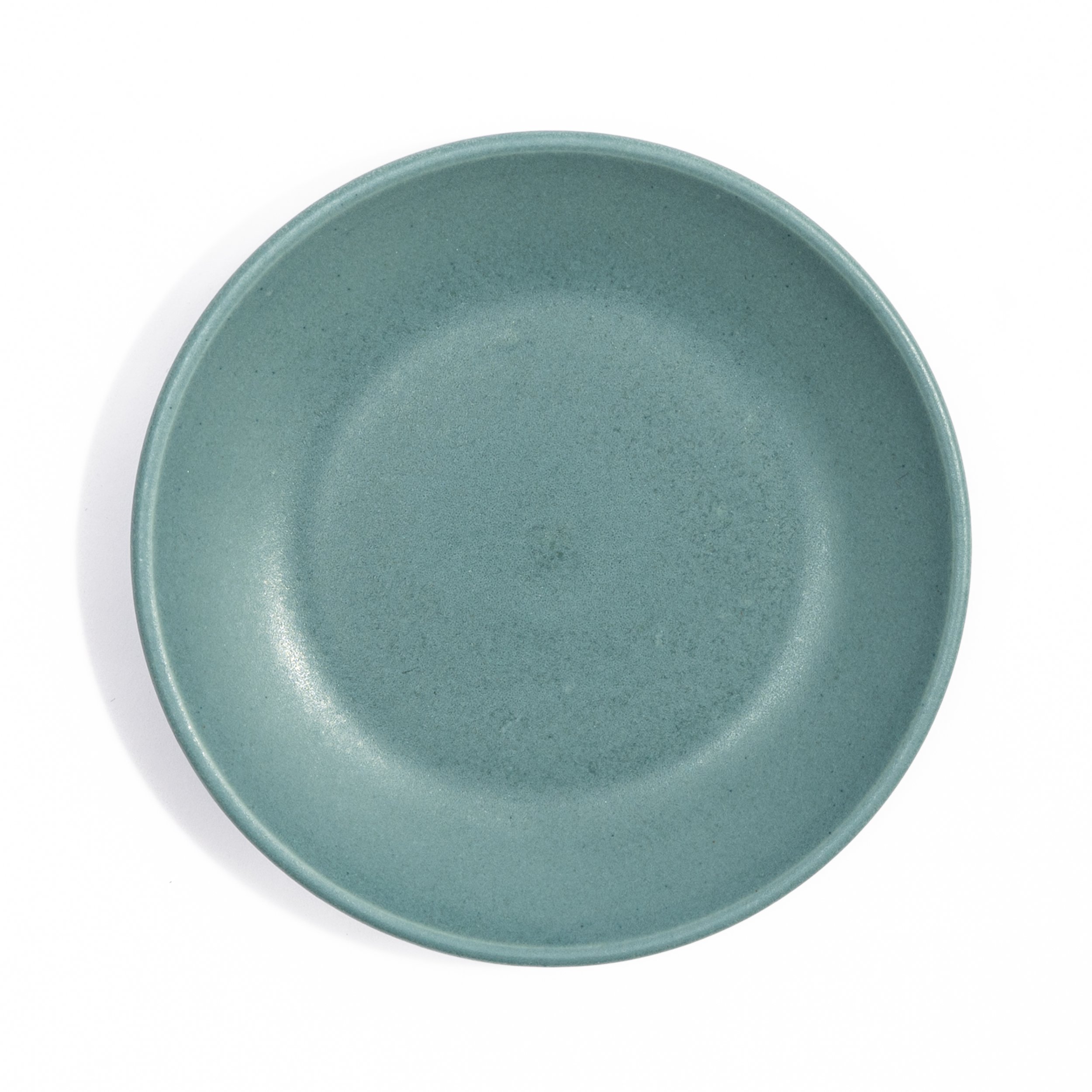
AGAVE
Cool grey-green with a smooth satin matte finish. The color of an agave plant in full sun, muted and dusty with just enough blue to keep it from reading as pure green. Quiet and composed on a table, pairs naturally with the warm glazes without competing.
-
SHALLOT
Warm cocoa brown with red undertones and a textured soft gloss finish. The defining detail is a soft leathered texture that gives depth and softness as light passes over the surface. Velvety in low light, warmly luminous in natural light. The glaze that surprises people most up close.
-
BRANDYWINE
Dusty rose-red with a fine speckle across a satin matte surface. Warm but not orange, deeper than blush, closer to the skin of a Brandywine tomato at peak ripeness. The speckle gives it texture and life at close range. One of the most food-forward glazes in the collection.
-
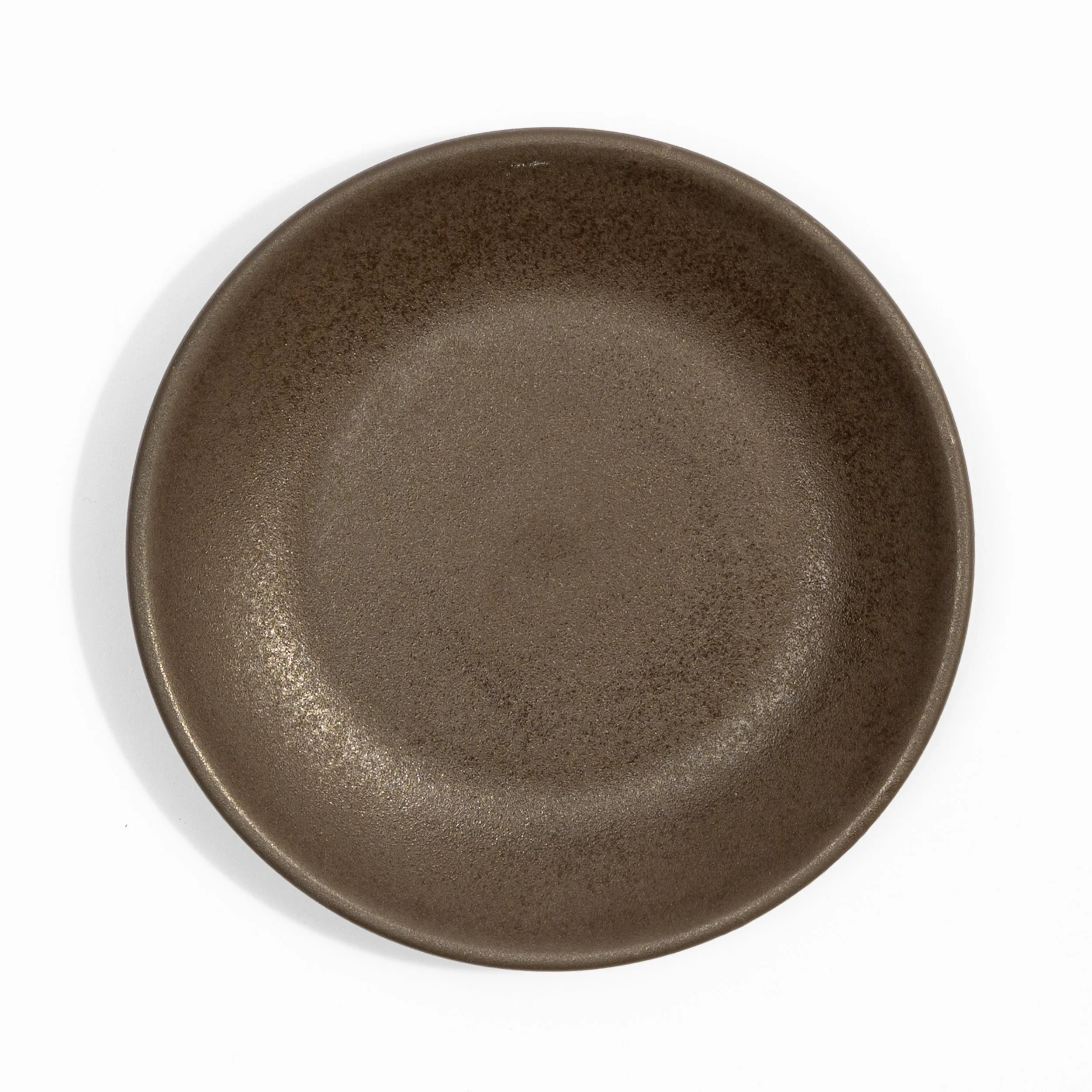
MOLE
Dark neutral brown with a dappled surface that shifts between matte and a soft luster depending on the light and angle. Dark enough to anchor a table without reading as black. The most texturally complex glaze in the collection.
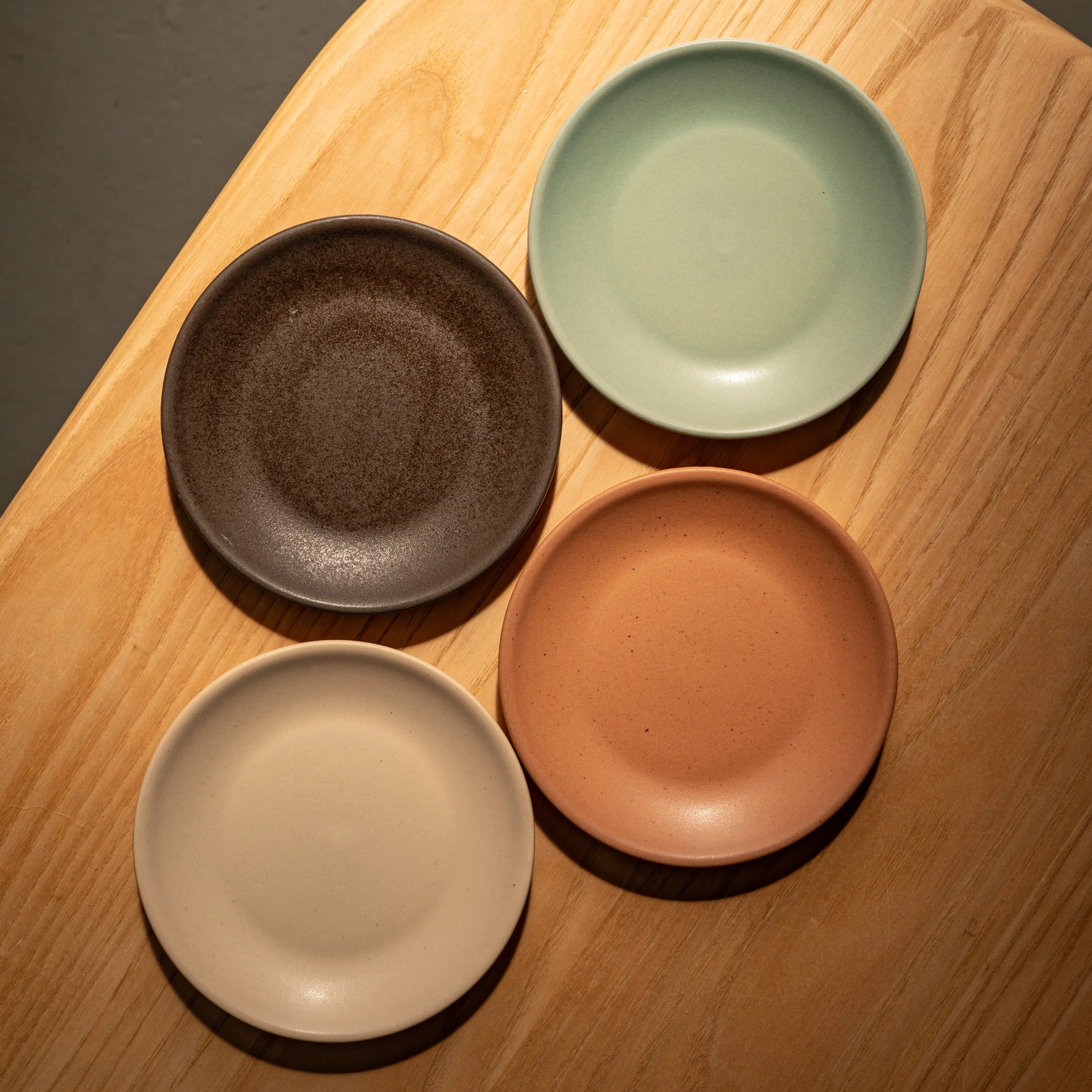
Agave, Mole, Shallot, Dove
Ready to specify?
We work directly with chefs, GMs, owners, and interior designers to build out custom orders. No price difference between Core Colors and trade glazes.
To request samples or start an order, email us at hello@myrth.us or use the form below.
Custom Glaze Development
Need something that's entirely yours? We work from a library of several hundred tested colors to develop a custom glaze matched to your concept, your interior, or your brand. Once it's locked in, reorders stay consistent.
Custom development is available for projects meeting our standard order minimums, with a development fee per round.
Tell us what you're after at hello@myrth.us
Let’s Talk
Share what you're working on and which glazes caught your eye. We'll take it from there.