How We Design New Glazes

Over the last 8 weeks or so the studio has been buzzing with creative energy as we redesign our dinnerware glazes. Glaze design and development is one of the things we feel sets Myrth apart from the rest, and we’re super proud of that. Today, on the brink of our new glaze launch next week, we want to share how we make our new glazes with you.
To create new glazes we design custom recipes that employ precise ratios and combinations of powdered natural minerals, rock and clays. With this development we are not only creating new colors, but we are also manipulating key attributes like hand-feel, texture, translucency, and durability of the final glaze.
The process starts with color direction setting. We’ll look at our current colors and review what’s working and what may not be. Then we usually dive into inspiration. This past January we took a trip to New York City + Brooklyn to shake off the creative cobwebs and immerse ourselves in art and design. Two things resonated with us during this trip: architectural materials and the paintings of Edward Hopper which we saw at the Whitney.
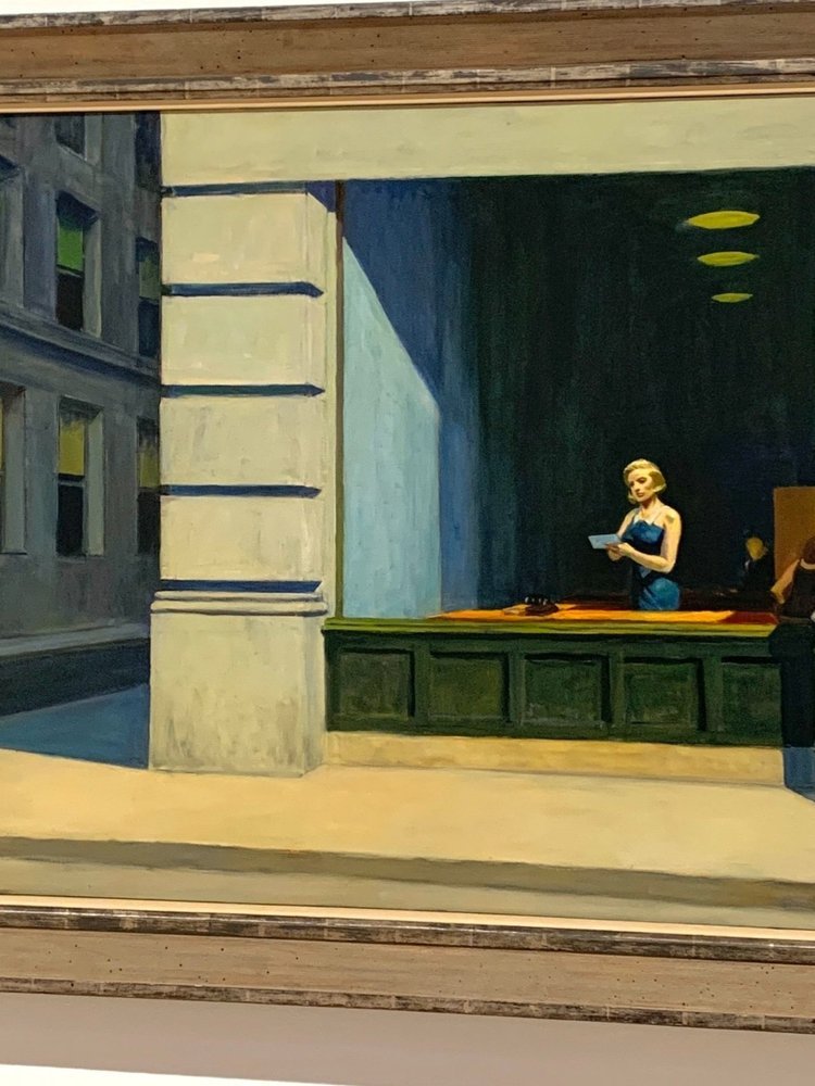
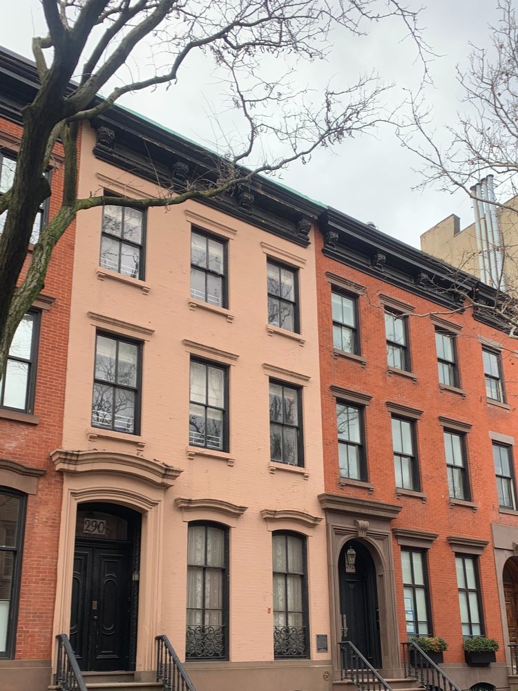
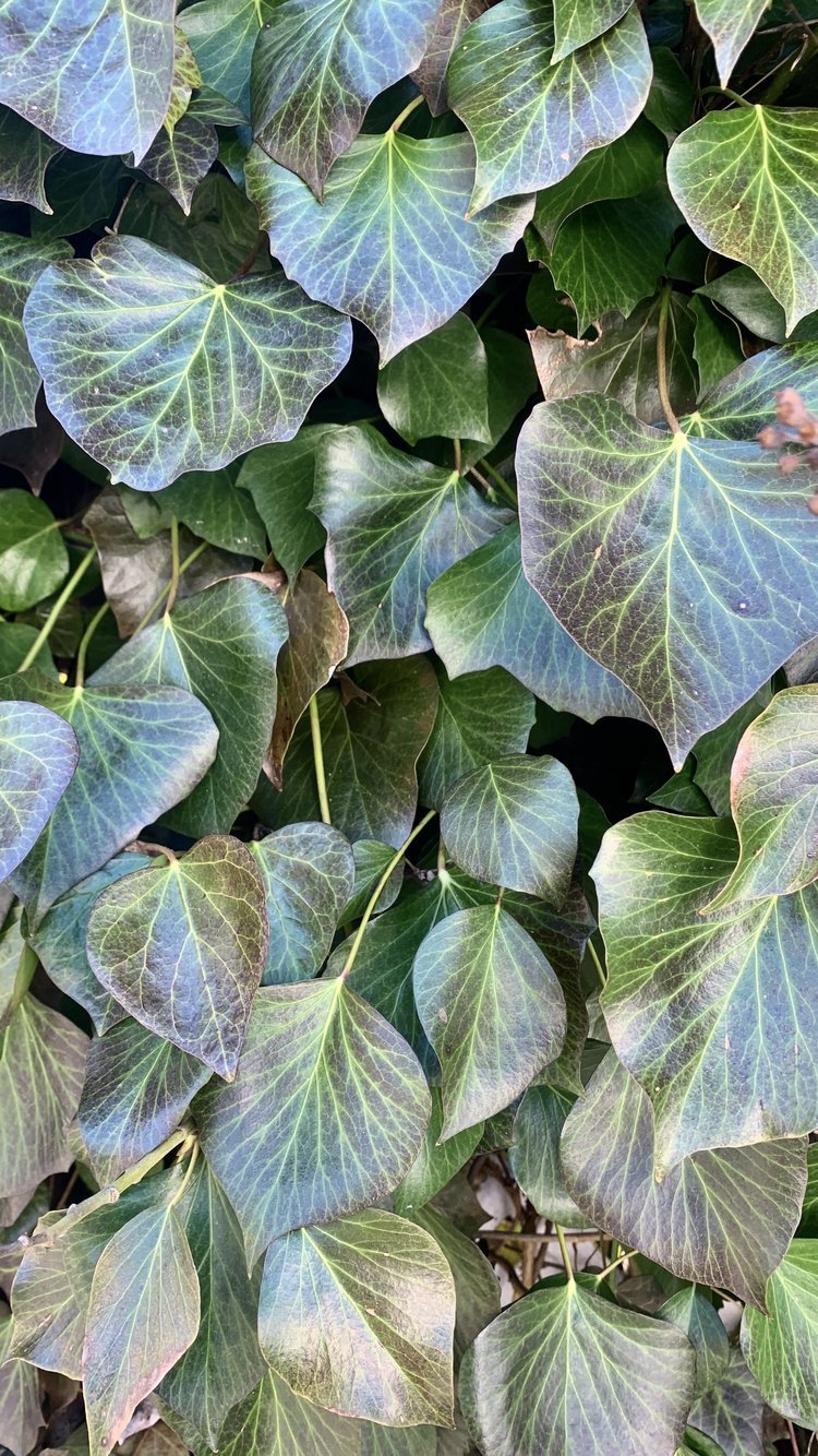
The colors of brick, ivy, concrete, copper, and slate seemed to stick out as we wandered the cobbled neighborhoods of New York and then visited the Noguchi Museum. The following day we viewed the Hopper exhibit and those shades were echoed back to us, but tilted by the artist’s unique lighting and casts of a moodier NYC. An inspirational palette started to form in our shared design mind. Eric and I tend to be on the same page, luckily, so our color direction was pretty aligned from the jump.
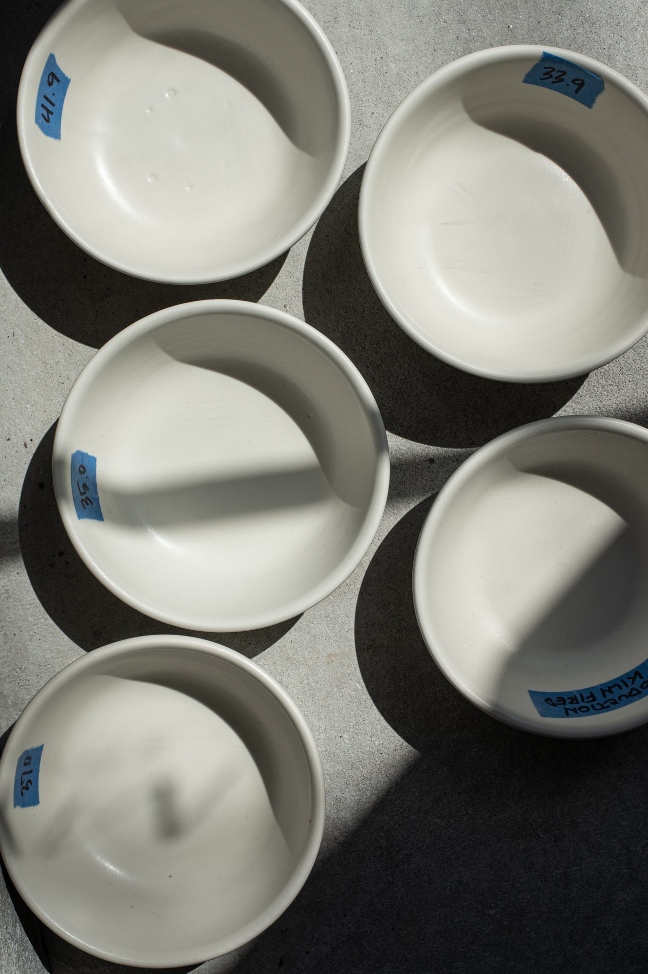
Back at the studio we began the glaze design process with base recipe trials. All glazes are first designed as a colorless white finish. This lets us focus on the glaze’s hand-feel, texture, translucency, and durability, without letting color distract us or, more importantly, affect the finish’s key qualities.
They may seem like simple white glazes but there is actually so much nuance in each sample we produce. Some have butter soft hand-feel, others rougher, while others demonstrate subtle textured surfaces. Each base recipe is tested thoroughly for durability at this stage. This ensures our glazes, and in turn our products, will hold up to everyday wear for years. You can run them through the dishwasher a zillion times and they are resilient silverware marking or the occasional knock from a clumsy hand.
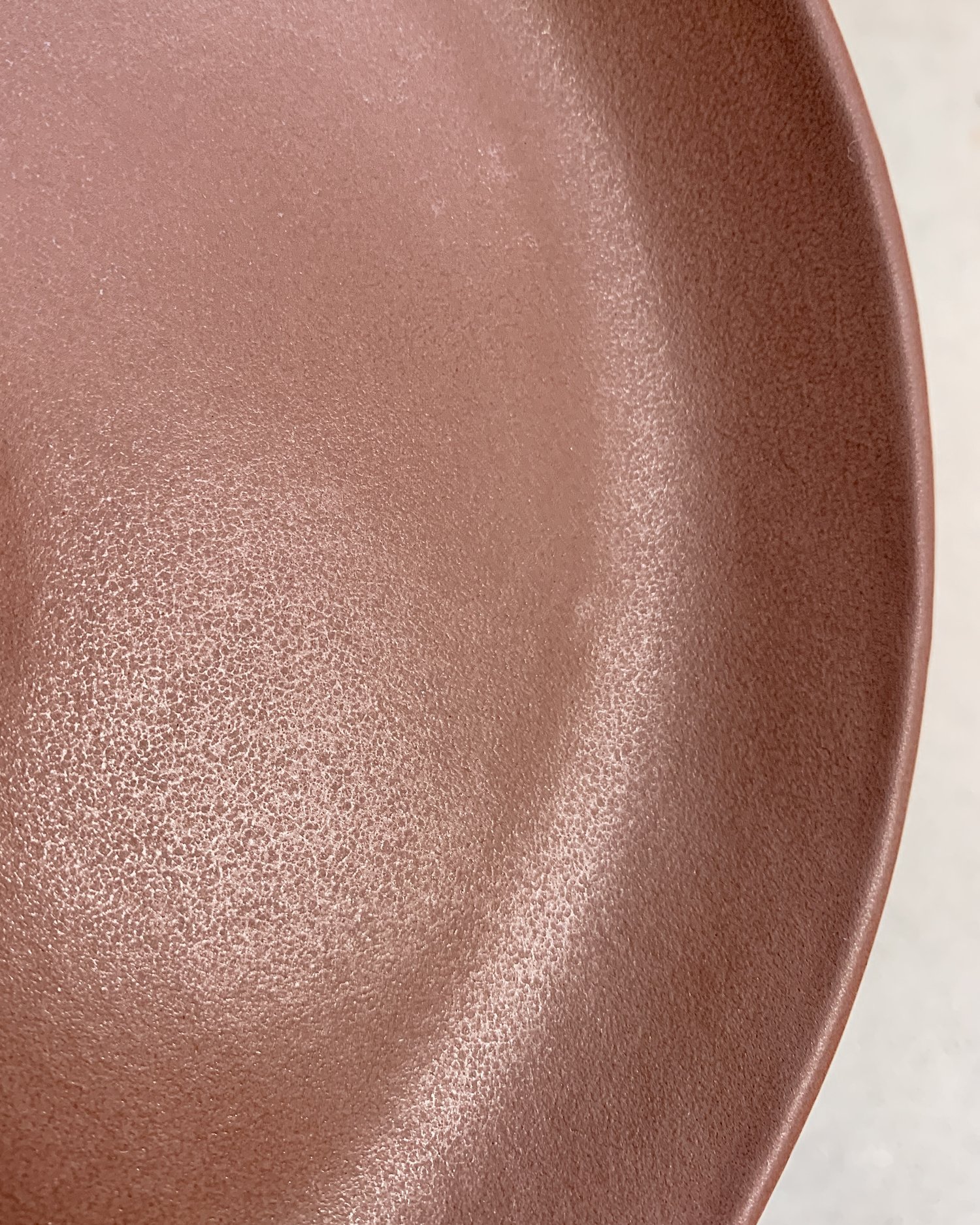
The physical texture of a glaze is determined at this phase. We consider texture our specialty because we take great care in creating it in our glazes. It makes our ceramics feel good in your hand, and also have a unique to Myrth finish that goes beyond just matte or gloss. Our past glaze Chestnut was a stellar example of this. It was a matte glaze but had a subtle luster to it which was due to its micro texture, a lot like the grain pattern of a fine leather. Our new glazes are aimed at really amping up elegant textures.
At the completion of base recipe testing we decided to confirm four new formulas. Having four options on what, in effect, is just white was actually a two-pronged strategic move. This allows us to diversify our raw materials with four different compositions, protecting us from future shortages, and we have four unique chemistries that, when combined with colorants, may yet yield even more exciting (and unexpected) results.
From here we moved to color development and things got exciting. We referred back to our inspirational palette and let that lead the color pigment directions we would pursue. Each white base recipe was tinted with colorants in dosages ranging from 1% to 6% (see the spectrums below). These unique colors were applied to test tiles, like ceramic color swatches. We probably went through 800+ tiles by the close of this project!
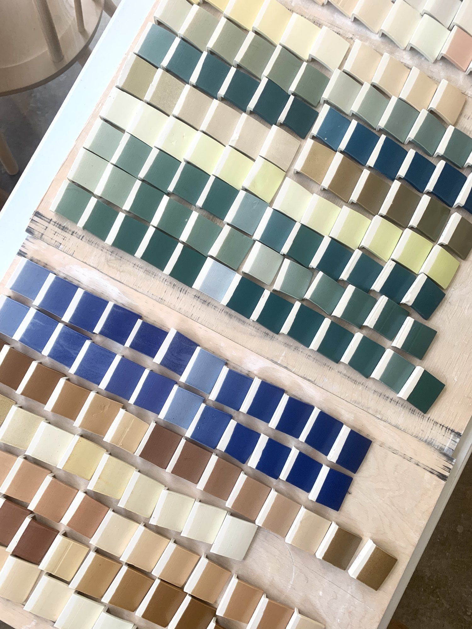
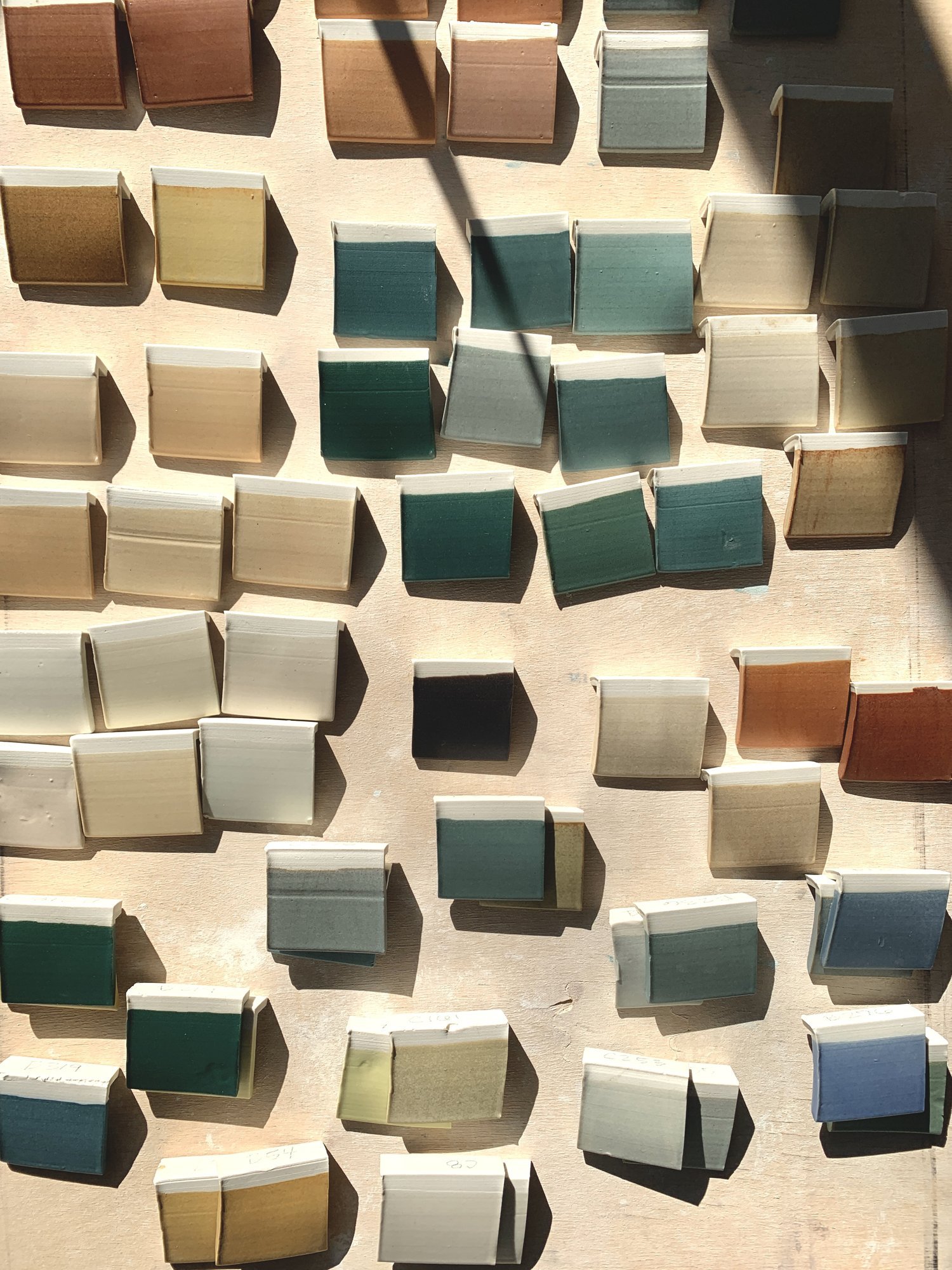
Slowly color directions started to emerge. Together we identified promising tiles and then plotted how we’d further developed their key attributes and color. When designing Myrth colors we really love to play on soothing shades that live on the edge of more familiar shades or those that are inspired by nature. We like to design colors and, more so, chemistries that you can only find from Myrth. To do this we mix color pigments and test test test until we have a unique and soothing shade that exudes the Myrth vibe.
In the photo below you can see the design phases of a new brick red color. Starting with Mesa and actual brick as our inspiration, we created a pigment range in tile format. Once we were happy with the recipe of one of these tiles we scale it up to a bowl to see how it would perform on a more complex shape. Also, the added surface area of a bowl gives us more more information on how a color will read. Sometimes scaling up makes us realize that a color is too bright or too saturated. In this case it was too dark so we reduced the pigments.

From there we live with the sample for a bit in the studio. Viewing it over several days and noting how the color changes as the light shifts throughout the day, as well as pairing it with other colors we are developing. In this case we loved the color but it was reading a bit too flat, kinda unexciting, so we added more texture. That did the trick! Sorry we’re keeping it hidden until next week 😉
While jumping into glaze development wasn’t exactly what we had planned for the beginning of 2023, we are super stoked on the colors that we have created. We cannot wait to share these new glazes with you next week. Our official new glaze launch will be Friday May 5th. Stay tuned for more details!